Pages

Tuesday, August 31, 2010

playing with shaped papers

Shaped papers are so much fun to play with. And it seems like just about every company is making them these days. Sometimes they can seem a bit challenging on what to do with them. Then again, sometimes they're so pretty you want to 'save' them for the perfect layout! C'mon, I can't be the only one that does that! 

So I thought I'd share a few different ideas on using those fun shaped papers. 
As a background
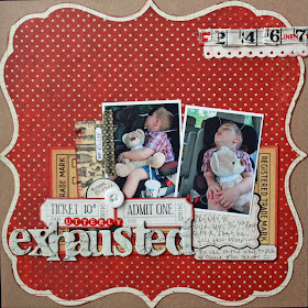
 Office Party kit (alphas from Seaside Cottage kit)
Of course, the easiest way to use those papers is by using as your background paper on your layout. I loved the red in this My Mind's Eye paper and it picked up the red in my son's shirt.
Using half of the page

Seaside Cottage kit
Sometimes it's fun to cut your shaped paper in half on your layout. In this one I used it on the bottom half and it 'grounds' all of my embellishments & photos on the page. And even better...you have the other half for another layout!

By the way, quick tip I did with my photos. I knew I wanted 2 for this layout because it just looked better but only had one. My answer - print one in color and one in black and white. Problem solved!
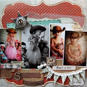
Take the middle out
 Sweet Sue kit (12 left!!)
For this layout I cut the middle out of the shaped paper and put the bottom & top half back together. This is also fun to do on a 2 page layout, splitting the halves between the 2 pages in your layout.
So what are you doing with those lovely shaped papers?? We'd love to see! And be sure to go check out the DT members' blogs. I'm sure you'll see lots of ideas on how to use those shaped papers!

Monday, August 30, 2010

A Challenge Layout!


So, I'm a total slacker loser, and didn't get my challenge layout done in time. Partly because I am scrapping on a folding table with scotch tape and little kid scissors, and partly because I just didn't have brain cells left in my head last night. Can I just say that caulking baseboards is NOT my favorite thing, but may I also say that I am a PRO at it? Yeah.

So, if you haven't seen the new challenge posted over on the challenge blog, be sure to check it out. Here is the inspiration photo I chose to use! I'm not much of a plaid person, I must admit, but I'm liking that kick of red in there with those neutrals and pale blue!


Anywho, here is my layout for this week's challenge. I loved the inspiration colors that Greta came up with! What an awesome idea!


This layout is the first in a great big series of layouts I'm gonna be doing about the new house. And since we'll be working on this place until the day we die, that's gonna be one big series!

I used the Sweet Sue Kit (hurry, only 12 left!) along with some goodies from my own stash. I LOVE that calendar journaling tag - what a great base for a title, huh?


I have been on an accordion flower binge lately, and decided to make a banner with them instead this time. I used the Basic Grey Adrian paper from the kit for those, and the star pins (minus the pokey part!) for the tops. Be sure you use a glue gun on these, they get a little wild!


So go on, have a great Monday and be sure to show us all your great layouts! We love seeing what you come up with!

Sunday, August 29, 2010

U Always!

Good morning! I hope you are doing well on this beautiful Sunday morning! I am sipping my coffee and enjoying the quiet before the kiddos get up! I have a LO to share with today using the new, "Sweet Sue" kit. Another FABULOUS kit packed with fun embellishments and papers! I decided to scrap these silly pictures of my son. He is a total ham and loves posing for the camera! I cut some large shapes to ground the photos and surrounded them with stickers by Sassafrass Lass.
I adhered the stickers to black paper and used a fine tip scissor to cut around the flowers and cut into the petals, so I could bend them up. I added various buttons and rhinestones to the centers.

The stars were punched and given a layer of Tim Holtz Distressing Stickles in Shabby Shutters. (Also in the kit!) I let it dry, inked the edges in brown ink, folded the stars up a bit, and added a rhinestone to the centers also.
I don't typically use many flowers on boy pages, but for some reason I felt like these "worked." Call them my "masculine" flowers! : )
Have a great day!!! And be sure to grab YOUR Sweet Sue kit! Only 13 left!!!


Saturday, August 28, 2010

Mini Tutorial


Hello, hello, hello! Today I thought I would share a mini toturial on how
to make a 3-D banner. It is simple, easy, and fun!!!


Here are the supplies that you will need.


1. Cut stripes of paper. They can be as small or as big as you want
them to be depending on what you will be using your banner for.


2. Fold strip of paper in fan like style like seen below.
3. Press together.
4. While pressed together cut out a triangle. This will create even
like triangles of the same size and also folded ones as well. You
will be needing the folded ones.

5. Take one of the flat triangles and one of the folded triangles. Place
a small amount of glue on the back of fold on the folded triangle.
6. Adhere to the flat triangle.
7. Repeat steps 1-6 to create as many as you want and you will soon
have a complete 3-D banner!!!
My baby girl Kyra is 3 months today so I decided to use my banner
to create this one for her! The kit used to make this page is Septembers
Sweet Sue Kit which is still available!!! I am so giddy when it comes
to Noels Kits!


I sure hope that you enjoy todays post and if you decide to
make this banner PLEASE share with us. We always love
seeing your work.
Catch you all next time around!!!


Friday, August 27, 2010

Scraplift Inspiration


I loved this layout that Noel made with the Office Party kit. I thought that the "Wild West" feel of the layout fit *perfectly* with the products in that kit! So, I marked it to scraplift.
However, I was browsing through some of the fabulous layouts posted on our message board, and I came across this one by message board member Robyn (created with the Lemonade Stand kit), and I just new I had to lift it too!
I combined the inspiration I got from both layouts and came up with this:
(Created with the Office Party kit)

Thursday, August 26, 2010

Mixing your kits....and a fun share!


Good afternoon everyone!! :D

Today I am going to share the LO I did for the awesome Layout Tag Team we did on the Noel Mignon Message Board! This was my first time participating in one of these and OMGoodness it was a lot of fun! It was really great to see the end result with the slideshow and see how each person interpreted the LO before them! If you are curious as to how this game works then just check out this thread here. :D One major thing I learned with this game is that I really need to work on making sure I turn out a LO fast! At least faster than I normally do, even if things go nuts at home! LOL! I really held the team up big time (SO SO SORRY GIRLS!), so next time I need to make sure that I stay on it! :D Cause it really is a fun game, and I hate to be the party pooper! LOL!

Anyway-the reason I was sharing it is because I decided to mix and match my kits for this LO, and I really had a lot of fun doing it! It is the perfect thing to do when you start feeling a little burned out on a kit, or are running out of things that are your normal go-to's in the kit. And it also lets you incorporate other colors and textures that may be lacking in other kits. Not that ANY of Noel's awesome kits are lacking by any means!! LOL! No she jam packs those things with tons of awesome stuff! My main reason for mixing the kits is to incorporate other colors-like with my LO I used Office Party but took a lot of pink and such from Lemonade Stand, which clearly isn't in Office Party. :D

I will tell you all that it totally started out looking kinda like Britt's LO (who's I was supposed to use as inspo), but it just veered further and further away! LOL! I had four photos on there, the fourth just wasn't fitting and these three looked better just as three so I stuck with them. And then the whole rest of the LO just started to change. :P But Britt's was the beginning inspo I promise! :D

So the next thing I was going to share with you is actually pretty stinkin embarrassing for me! So please please do not laugh at my shares here! I do it enough for all of us, trust me! The LOs and cards I am sharing below are actually from my very first Noel Mignon DT application from back in May of 2008! That's right! I tried out very very early in my beginning scrapbooking days. These LOs and cards aren't really ones that I EVER share anymore with anything, but they are no secret because all you would have to do to see them is just go the beginning of my blog. :D I looked up my first application and read my little blurb that I had written to Noel, and I could not stop giggling and hitting myself in the head over how silly I was back then! We all laugh at ourselves when we look back. Or at least we all should. :D But the thing that really got me in the blurb was the fact that I said I had a 9 month old daughter!!!! OMgosh! I can't believe so much time has gone by and that my daughter, who will be 3 next month, was actually ever that tiny! Boohoo! :( They grow up too fast.

Ok onto the shares: You can totally see in these how much my scrapbooking-and photographing-have changed! I just can't stop saying OMGOSH what was I thinking?! LOL!
See what I mean?!! Oh so embarrassing! LOL! I remember making those like they were yesterday though! :D Fun times.

Last thing I am going to talk to you about is the Sweet Sue kit! Mine is in the mail as I type on it's lovely way to me, and I can't wait!!! :D Everything in this kit looks divine! There are still 13 left (I think, some may have been bought since I typed this...), so run over to here and pick yours up! Full list of contents with the link above. And be sure to also check out Virginia's adorable video of the contents on the blog here!! She always does an awesome job of displaying the kit so nicely in her videos! :D

Take Care everyone!! Hope you all have a great day!

~Amy

Sweet Sue: Quilt Blocks and Repurposing


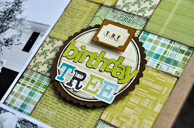
I've got a new layout today to share with you using the gorgeous "Sweet Sue" kit. For my twin daughters' 1st birthday, their grandparents bought them a Norway Maple tree that we planted in our front yard. I wanted to document this on a layout but in the pictures we took, everyone was wearing a different color. I decided to turn my photos black and white and went with earthy shades of green, brown, teal and cream for my layout. 


I pulled out almost every green patterned paper that was included in the kit and decided to make a quilt block collage with them. I love the texture each patterned paper adds. I used one of the Elle's Studio label die-cuts as the base for my title but it said "June" on the top. I used another Elle's Studio label die-cut and some Jenni Bowlin alphabet stickers to cover that up since it didn't go with my layout. 


I used several Elle's Studio label die-cuts for my journaling across the page. 


I adhered a few Sassafras Lass flower stickers and accented one of them with a vintage button in the kit. 


And there you have it! I loved working with this kit and can't wait to create more! 

Until next time,
Jill

Wednesday, August 25, 2010

Quick Tip - Die Cuts


Happy Wednesday everyone! Diana here with a quick tip on altering die cuts. In this month's kit, Sweet Sue, we had this adorable leaf tag die-cut from We Are Memory Keepers.
When I was putting my layout together my poor Prima flower was in need of some company. I knew the leaves in this die-cut would be the perfect addition but just putting the whole die-cut there didn't look right. So I decided to carefully cut out the leaves and flowers. You can also save the frame portion for another layout if you wish.


Here is my finished layout. All items are from the Sweet Sue kit except for the little pearls in the butterfly. Hurry and get your kit today! They are selling like hot cakes and there are only a few left!


Happy scrapping!
Diana