Hi everyone! I'm back this week with a layout using the July Boardwalk kit and I have a fun little tip for getting more from your punches. You do have a punch or two laying around, right? I know I do! :)
Have you ever thought about using them to make a shape other than what the manufacturer originally intended? I did just that when I pulled out my beloved Jenni Bowlin Blue Ribbon punch. Obviously, its intended for making ribbons with these pieces.
It is great for that, but I noticed how the flowers in the Pebbles paper were almost the exact same shape as the medallion part of the punch so I switched gears and started punching the shape in various colors to make flowers.
For the leaves I punched the shapes in a green paper and rounded the square edge of each piece to make leaves, then I attached the leaves under the flower.
Once they were assembled I scattered them on the page for a whimsical look.
They look almost identical to the smaller flower in the Pebbles paper, don't you think?
So what punches do you have in your stash that you can use in a fun new way?
Pages
▼
Tuesday, July 31, 2012
Monday, July 30, 2012
Go Your Own Way
It's that time again...
Monday, Monday, Monday :D
I'm dropping by today with a quick post to show you a layout I created
using the July Boardwalk kit:
I really REALLY like all the bright, fun colors in this kit.
I ESPECIALLYlike L♥VE the yellow Thickers!
It was fun to create my title using them, right ON my photo.
I ESPECIALLY
It was fun to create my title using them, right ON my photo.
here's another close up:
thanks for letting me share with you today!
I hope you have time to break into YOUR kit & have a ball like I did.
Enjoy your week!
I hope you have time to break into YOUR kit & have a ball like I did.
Enjoy your week!
~Leslie
Friday, July 27, 2012
Happy cards from West Coast!
We have been away on a little vacation, so my scrappy time has been a little inhibited lately, but I managed to squeeze in a couple of cards using the brand new West Coast kit (there's a couple left!) because I just couldn't wait to play with it!
I went along with our design team inspiration theme this week- chevrons and arrows! Goodness, I love those elements!
For this card, I cut out some chevron pattern from the woodgrain paper in the West Coast kit, and then used it as a template to add another layer of color using the minty blue paper.
And how adorable is that little clothespin? And the banner stamps? I die.
**************
This next little card is really simple, but I think it'll be a perfect card to brighten someone's day. I've had the idea for a while to incorporate photos into a card's design, and this little silly pic of my Sabby is perfect.
I used the scraps from the previous card to make arrows out of the chevron design, and then layered a cute little arrow sticker on top. It's a subtle design element that puts all the focus on the photo! :)
I hope you enjoyed my cards today... I'll be back later tonight with a video with all the West Coast kit contents! :)
Thursday, July 26, 2012
Arrows Everywhere!
This week's inspo is definitely inspired by the arrow.
And boy do I love arrows.
As I contemplated my project for this week I realized how many supplies that I have that are geared toward the arrow...lol...stamps, pp, punches, chipboard, and the list goes on and on.
But I decided for my project this week, I would make a lil mini altered dollar store canvas to hang in my bedroom. I've got quite a wall going of altered canvases that I've done with pictures of my husband and I and thought this project would be a perfect addition.
I started with a 6x6 size canvas I got at the dollar store and covered it with kraft packing tape that I got at the UPS store.
In random places I added some Distress Crackle Paint from my stash for some texture.
I decided that since this was going in our bedroom, I wanted to use the Charm School Kit for the papers and embellishments.
Using the Silhouette (of course ;) I took one of the October Afternoon pp from the kit and cut various shapes and sizes of arrows which i randomly placed on the canvas.
Add a photo and a few embellies and I ended up with a new addition to our wall :)
(sorry for the blurry pic. The light in my house was horrible :)
How are arrows inspiring you?
Wednesday, July 25, 2012
The Sweet Life!!!
Hello Everyone!!! As you can tell from the earlier posts this week, the design team is being inspired by chevron & arrows this week!!! YAY!! With the soft, muted palette of my photo, the papers & embellishments in the Summer Wind kit fit just perfectly. I had it in my mind that I wanted to create a border of arrows. I found an old Cuttlebug die in my stash and set to work cutting all these small arrows in a variety of patterned papers. I think this would be a fun idea to try with any of your small dies or punches - not to mention a great way to use up some of your scraps :)
Here is a close-up of the arrow border. To help me in placement, I drew lines down first :) You might also notice that pleated paper behind the chevron - paper folding is a fun & easy way to add some texture to your pages!!
I LOVED this Pink Paislee tag to house my title work - a fun mix of those raw chipboard thickers & the My Minds Eye layered sticker :)
Now, head on over to your own scrap space & see if you have any small punches or die-cuts to create your own custom border!! Can't wait to see what you all create in the gallery!!
Tuesday, July 24, 2012
Girls Rule!
Hi everyone! I'm here with a layout using chevrons for our Monday Inspiration. I carried the chevron design through my layout in my shapes and the pattern of my paper!
You can look forward to more arrow and chevron projects on the blog all week long. I can't wait to see how they inspire you!
Monday, July 23, 2012
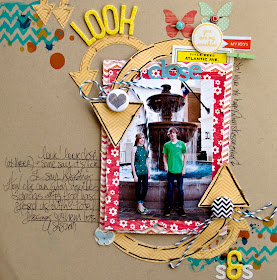
*Look Close*
Good morning everyone! Happy Monday!
Have you noticed that THE print right now is Chevrons?
They are everywhere.
They are everywhere.
In home decorations, on clothing, on scrapbook pages.
EVERYWHERE. I ♥ it!
I'm a fan. BIG fan. Especially when arrows are part of the mix.
Today I'm sharing a layout I made with arrows & chevrons.
It's part of the Monday Inspiration over at the Noel Mignon board!
You have to go check it out! LOTS and lots of lovely things to keep you inspired
It's part of the Monday Inspiration over at the Noel Mignon board!
You have to go check it out! LOTS and lots of lovely things to keep you inspired
to make lots and lots of things from either chevron and/or arrows.
Here's my take on the inspiration:

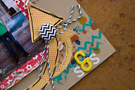
Here's some close up shots:
I created the arrows using my Silhouette Cameo & files from Silhouette.
I had so much FUN making this layout.
Adding elements from the kit really tied it all together.
Adding elements from the kit really tied it all together.
Make this week a wonderful crafty one.
Friday, July 20, 2012
Getting sketchy with Julie!
Julie Bonner gave us a fabulous sketch challenge to work with for the next two weeks, and I couldn't wait to try it out! Click here to see her sketch and to join in! One randomly drawn winner will receive a $10 gift card to the NM shop! So fun.
Here's my take, using the Boardwalk kit:
I loved how the pearl stickers added a bit of a reminder of "splashes."
I wasn't sure how I was going to use the cute little "Boardwalk" card when I first got the kit, and I kept saving it for something special. I think it fits right in with our splashpad pics!
I can't wait to see how all of you interpret Julie's sketch!
Thursday, July 19, 2012
Mask Mania
Happy Thursday everyone!!
Today I wanna talk about masks.
Everyone loves em and everyone likes to use em.
They are great with mists and various other mediums like gesso, but they can tend to get pricey and the backgrounds/designs that you are looking for may not be available.
So I decided to try and make my own.
I grabbed some transparency sheets from the office supply store. These are the sheets that are used for an overhead projector (like the ones the teachers would use at school). I then picked out the design that I wanted to use on my Silhouette that would be perfect for the project that I was working on.
Now you don't have to use just a Silhouette for this. You can use your Cricket or even print an image on the transparency sheet and cut the image out with scissors or an xacto knife. Which ever method words best for you and what you already own.
If you are using your Silhouette, I will tell you that I chose the "Transparency" setting and then turned the dial from "3" to "4". I also sized the design from 8.5x11 to 8.5x5.5 so I could make two masks per sheet.
I held my breath and crossed my fingers that this would work.
And voila!
My own custom made mask.
I used this mask to make a card for a friend.
I only wanted the bottom part of the card to get misted so I covered the top part with a piece of paper.
And sprayed away (I used a mixture of India Inks and water because I didn't have any blue mists).
I think it turned out pretty good and comparable to other masks. It ran a lil but that was because of the sprayer that I used. Gives it more of an artsy feel huh? :)
The finished card (Cruise ship Silhoutte shape cut out of pp and "Bon Voyage" stamp).
Easy right?
I couldn't stop there though and decided to make a mask with honey comb shape. I love this lo and it helps that the Hudson Valley Kit is so easy to work it.
As you can see, the possibilities are endless :)
Wednesday, July 18, 2012
Sketch Contest!!!!
Hello everyone & Happy Wednesday!!! Super excited to be here to share this month's sketch challenge - YAY!!! Here is the sketch for July . . .
Now, if you are not a fan of using small pics, no worries!!! You are more than welcome to use simply one pic or as I did, pile up a whole bunch :) The layout I created is full of scrappy goodness from the July Boardwalk kit. I recently took a bunch of Instagram pics of the kiddos playing in the pool at Grammy's and wanted to document all the fun they had. None of the pictures were showstoppers, but I just loved how they displayed how much fun they all had that day!!!
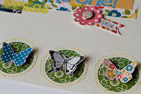
I machine stitched the circle border, but made sure to leave some space for those flower elements depicted in the sketch. I used the gorgeous My Minds Eye rub-ons from the kit to create little clusters of flowers. I also used my exact knife to cut away part of the "hello there" pennants on the Echo Park journaling card. This allowed me to tuck my photo underneath them :)
Tuesday, July 17, 2012
You're Still the One!
My husband and I celebrated 23 years of marriage earlier this month. I thought it would be fun to put together a layout that showed although a lot has changed over the years we've been together, one thing remains the same...he's still the one!
I used the July Boardwalk kit. The butterflies and bright summery papers were perfect for the occasion.
The butterfly button was designed and made by Shelley, our guest designer last month. This button and many more can be purchased in the shop.
Sometimes I like to incorporate my title right in with the journaling, like I did here. I stamped my journaling first and then used the Pink Paislee alphabet stickers to create the title at the end of the journaling block. The larger size helps to put an emphasis on the title.
Thank you for letting me share! I hope this inspires you to make a layout featuring a special relationship.
Have a fabulous day!


.png)


