Pages

Monday, August 31, 2015

Happy Little Moment...


Happy Monday! Today I want to share a layout with you that I created using the Noel Mignon Country Life Kit. Anyone who knows me, know how much I love anything floral, so when I saw this paper, and a some of the flower embellishments, I knew exactly how I wanted to put this layout together!
 I started by using a bit of gesso on the background paper, behind where the photo would be going.  Next I splattered lots of the Heidi Swapp Butter Colour Shine that came in the kit.  Once that dried, I grabbed Metallic Melon & Metallic Blueberry Gelatos, and scribbled them on my craft mat, then spritzed with water, then used my finger to apply it around the yellow splatters.
 Next I went crazy layering all kinds of paper, doilies, and embellishments together.
 Thanks for stopping by!

And if you are interested in the Noel Mignon Country Life Kit there are still 2 left in the shop, so grab one while you can!

Saturday, August 29, 2015

4x4 Pockets & Daily Diary


Welcome back everyone! Wow...I cannot believe August will soon be over and this is my last official pocket page for August to share.  This month sure did whizz by.  I hope your month was filled with many memories and moments so you will have tons of photos to scrapbook with this incredible kit! ;)


I always let my Noel Mignon Daily Diary kits take the lead when I am creating.  By this, I mean I usually allow the products to guide the types and styles of pages I am going to create with the kit.  This month, I noticed a lot of the products were really fun and different square sizes of products.  There were fabulous little 2x2 die cuts, awesome 3x4 cards and these really cool 4x4 die cut frames.  They all inspired me to create something different with the kit, yet I ended up with all pocket pages...just very unique from one another.  I love when that happens! :)


So for this layout, I allowed myself to be inspired and drawn to creating a 12x12 pocket page, with 4x4 squares.  The gorgeous die cut frames were my total inspiration for this page.  I love the size, the style, the colours and how cute they adorn my photos.  They are truly the funnest overlays and really make your photos pop!


I hate wasting product, so I am always looking for alternate ways to use up remainders of my kit and stash.  So because I did not have enough of certain papers to fill the large 4x4 pockets I simply created these fun triangles and alternated patterned paper.  I then used my Fuse tool to secure them in the page nicely.  The 'hello' card was actually a 4x6 which I trimmed down accordingly.  I then used the awesome Project Life alpha stickers to add the 'sunshine' below.  I love how alphas can be used to customize cards for whatever layout one is doing.  This kit came with so many alphas, I loved it!


In keeping with using up my stash, I created the "days like this are the best" card by simply trimming down a 3x4 card and adhering it on top of a 4x4 card.  The centre card, with all of the word strips I love!  I simply took these wonderful strips, and using my sewing machine stitched them onto just a white piece of 4x4 card stock.  The super cute camera clip I clipped onto the top.  I just loved this piece from the kit!


I added my journaling this month directly onto a 4x4 card that I initially trimmed down from a 4x6.  I knew I wanted to add in my thoughts onto the pennant so I made sure to trim so that I would have enough room, yet fit my pocket.  I simply jotted down my thoughts and I love how it all turned out and helped to complete my page.


I hope that I have inspired you to get out the remainder of your August kits and use up that stash!  These kits go such a long way and there is always a way to make something work for you when you need it!  Happy creating everyone...I am ready for September's phenomenal kit, aren't you?

Friday, August 28, 2015

sweet moments

Hey guys, Michelle here with another layout from the Country Life classic kit!  This time I decided to play with the Heidi Swapp mist a bit so I sprayed that on my white cardstock before adhering my photo, patterned paper & embellishments.
 
I love that the kit comes with several doilies which are great for layering on pages. I was going to add some stitching to my page but then I realized there are those great stitching rub-ons - perfect!
Also, don't forget, the Show & Tell classic and daily diary kits are now up for sale! So be sure to snag one before they're gone.


Thursday, August 27, 2015

Country Life Daily Diary Photobomb

Hello creative friends! Michelle Zerull here, to share another project that I created with the Country Life Daily Diary Kit. Usually I make Binder pages and I seldom make 12x12 pages, so this was a stretch for me. But with all of the beautiful 4x4 cards included, I knew that I wanted to include this in my "big" album.
This layout was inspired by the frame that I used in the center. It was a creamy white that wasn't prevalent in the other papers, so I added acrylic paints to some of the papers to unify the look.
I'm all about customizing the papers. Paint is relatively cheap and a little goes a long way.
Notice the photobomb in the background? My family is a lot of fun. I didn't even realize that they were back there until after the photo was taken! :)
The month is almost over, but there's still lots of fun left. Enjoy your day!

Wednesday, August 26, 2015

Birthday Boy "Country Life" Classic Kit

This is my last post featuring the "Country Life" Classic Kit.  I simply adored this kit and all of the bright colors.  It worked so well with all kinds of pictures of mine, from birthday photos, to wildflower fields, to Spirit Week at my kid's school---and lots in between.

This week I'm sharing a layout that I used quite a few of the stickers from the 12x12 sheet of Basic Grey Tea Garden banner stickers.


First I used the banner stickers to create a traditional mini banner across the bottom of the pages. I also used a few chipboard frames from the Noel Mignon "Shine Bright" Classic Kit (from earlier this year).


I used the banner stickers to create a little cluster on the top of the right hand side of my layout as well.


The Pretty Little Studio word flags made for some cute additions on the layout, along with the piece of the branding strip  which says "Father, sister, brother, mother".  The branding strip is from a piece of Pebbles paper.


Thank you for checking out the blog today!  Have fun working with the "Country Life" Classic Kit.  If you don't have one yet, I believe there are 2 more available in the store, right here.  It is jam packed with cuteness!!!


Tuesday, August 25, 2015

Home Life with Country Life Daily Diary Kit

Hello Everyone! Hope you're doing well. I'm back today with a Project Life page using the awesome Country Life Daily Dairy Kit. A few weeks ago I spent some time at my parents house helping my Mom recover from shoulder surgery. Since I was going to be away for close to two weeks I brought my furry family with me. Everyone got along well and Mom is doing great!! My parents neighbors were so good to my Mom, stopping by to see if she was doing well. The Country Life Daily Diary kit coordinated so well with my photos from that week! Here's my page.
I love how bright and summery the kit is. Included in the kit are a few doilies and if you know me, you know how I love doilies!
There are several fun journaling cards included which I typed on with my vintage typewriter.
Here's a few more close-ups.

I added some stickles to the sunflower 3x4 card.
 
Thanks for stopping by today and there are a few Country Life Daily Diary kits left so grab one - you won't be disappointed! See you soon!
 

Monday, August 24, 2015

Beach Bums

Happy Monday everyone! Today I want to share with you this layout I created using the Noel Mignon Country Life Kit. Last week the Design Team created projects around the awesome theme "Life Lessons" and this layout fits in with that theme, so I thought I would share my "Life Lesson" with this layout.


My Life Lesson is "Make Memories".  We were on our 1st big family fishing vacation in 4 years, and before we left Clay and I had discussed that this vacation was all about the boys and making awesome memories. 

One day on vacation we went out for a boat ride and stopped for a shore lunch on this tiny little inlet on the lake.  The boys had so much fun running around, splashing, playing, swimming, digging and building sand castles.  The next day (and everyday after that) this is where the boys wanted to have lunch, so as long as the weather was nice, this is where we all went!

Since we have been home, well over a month later, the boys still chatter about "remember when we had lunch in the water with Aunt Sue, Uncle Ken, Jack, Lizzy & Molly? That was so much fun!" I am so happy they have fun memories of our summer vacation!

For the background on this layout I used gesso, then used my gelatos, and mists to make a water like background. Next I used the Barn Stamp, and the cap from the Heidi Swapp Color Shine that came in the kit and stamped with several blue inks to create the circle and "arrows".
 I love all the little embellishments that came in this kit! They added the perfect little touches!
 If you are interested in the COUNTRY LIFE KIT, there are only 2 left in the shop, so hurry over before they are gone!


Saturday, August 22, 2015

Crafting Life Lessons with the Daily Diary Kit

Happy Saturday to you all. I found myself recently taking a lot of photos on a particular day. It wasn't officially a "Day in the Life" project but I wanted to document what a day was like for us this summer, the summer before we enter a new era of a school-going kid. I took out my Country Life kit to document it.


If there is one life lesson I have learned in crafting, it is to not overcommit myself to a project and to remember that it's okay to do a project on my own terms. This is no where near a full day documented. I didn't set my camera on a tripod to catch myself doing the daily routines; most of these pictures were taken with a few hours of each other. But this is pretty representative of a day in my life this summer even if it is lacking a few extra details.


Another life lesson I've learned in crafting is nothing will ever be perfect. There will always be something you wish would be different or could change on your page. But at some point, you've got to just let go and let things be as they are. I didn't particularly like the way this die cut heart made that picture feel too heavy. I worried that it made the whole layout a little off-balance. When I tried to pull it off, it was going to rip my photo so I had to let it be. So then I added a few other embellishments, using a red word art strip because having it be the same color as the heart made it so that it didn't add much extra weight. The small wood veneer heart in contrast with the larger die cut heart also seems to make it feel a little lighter, in my opinion. So is it perfect? No, but it works and I'm leaving it.


Another crafty life lesson I'll share with you today is that it's okay to go outside your normal style. On this "remember" card, I did several things that I don't normally. First, I made a smaller photo on top of a patterned card and then I included a lot of layers (for me anyway). It's busier than I tend to go but it was what I was feeling at the moment. I used to be concerned about all of my pages having similar styles so the albums seemed more cohesive, but now I've realized that nobody will ever be looking through my Project Life albums pointing out how varying the styles are. They will be more interested in the pictures and the stories. So I do each page how I feel inspired to make it and am no longer worried about overall album cohesion.

That's all I have for you today! I did an unboxing video for the September Daily Diary Kit called Show and Tell. You can watch it here.


Friday, August 21, 2015

Beauty // Life lessons with the Country Life kit!

Hey all!!! The design team has been sharing projects all week with the theme "life lessons" and today I have a layout to share with the Country Life classic kit. I'm still saving some of the kit to create some pages for apple picking next month ;) 

Today my layout is all about stopping to smell the roses...or sunflowers in this case. We definitely live in a go go go world but sometimes you just have to pull over on the side of the road and check out the view...especially when the view is acres and acres of beautiful sunflowers!!
I lucked out that there was sunflower patterned paper in the kit - yay!!! And here's a tip for saving some of that patterned paper for future projects - instead of using the entire sheet & layering on top of it, I will cut it just small enough for my needs and attach it to some cardstock (usually cardstock that I probably won't use). 

You can see how I did that here:
I used 6x12 pieces of the patterned paper attached to cardstock so I still have the other pieces to use for other projects. One of those had a super cute watering can print that I want to use for another project so I didn't want to waste it!!
But back to my layout, I printed one of my photos at a larger size so you could fully appreciate the sunflowers in the photo. Then some layering finished it off!!

And here's another tip - I didn't really feel like journaling on the front of my page (I just didn't think it would really add to the page). When this happens I'll usually just jot a couple notes on the back of the layout. You know, in case we ever want to know more about the photos years from now :)
 

Thursday, August 20, 2015

Life Lessons, Me & Daily Diary


Hi everyone!  Today I am sharing a pocket page I created using August's Daily Diary Kit.  This week's focus has been on "Life Lessons".  I always love an opportunity to "dig deep", to write and reflect on things that I know to be true, things that I need to work on, and things that just bring me back to a place of centre.


Life is crazy. Life is busy.  I know for me, scrapbooking and paper crafting has always (and will forever continue to be) a place that brings me much peace, solitude and joy from a very chaotic and noisy world at times.  So to celebrate this, and to reflect on some "life lessons", I created this very simple pocket page to showcase some photos, some of my favourite life lesson reminders and personal journaling.


I used a 9x12 grid pocket page.  I created each of my 3x3 pattern paper squares from the kit.  I wanted to keep a similar colour trend going so I stuck close to the pinks and reds in the kit, popping the centre with the gorgeous blue and green floral card.  One of my favourite embellishments in this kit is the "this is the good life" banner.  So I simply used my sewing machine and stitched it to the 3x3 card.  Again, I wanted to keep this page simple.  Because for me, simplicity and "keeping things simple" is a huge ongoing life lesson for me.  I wanted my pocket page to reflect that.  To remind me that scrapbooking doesn't have to be complex, or difficult, or too busy and with too much stuff.  It can just be a mix of pretty patterns, photos, and a few extras and still be beautiful too.
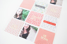

I included some of my very favourite phrases into my pages.  "Choose Happy", "Smile Often", "Create Daily" "Be Brave" and "Love Always".  To create these cards with these phrases, I used the fabulous Project Life Alphas that were included in this month's kit.  They come in such a fabulous font...there are a million alphas...so I knew I would not run out of letters either. It was perfect and worked out great.


I then also added some personal journaling on 2 of the 3x3 cards.  One I wrote down some thoughts, and the other I simply chose words that pertain to happiness and just repeated them over and over.  I love how it created a background on the card and helped to accent the "happiness" sticker.


I really loved this challenge, and found it very therapeutic for me.  I love to create, but sometimes we all need reminders that bring us back to what matters most in life.  I am happy to have this page and add it into my collection for whenever I am needing inspiration, a quick pick me up...or to just look at pretty pattern paper! :)