Pages

Thursday, June 30, 2016

Documenting Wk 24 with Summer Lovin'

Happy Thursday! Danielle here to share with you Week 24 of my Project Life using my  Summer Lovin' Daily Diary Kit.
 This weeks design team challenge is "Against the Grain" - use woodgrain on your project.
 I used the woodgrain Elle's Studio 4x6 Card and some of the wood veneer pieces for the challenge. I love the pops of hot pink, orange and yellow in the months kit!
 and Noel included lots of fun bits to embellish with this month! I am in love with the Imaginisce Layered Stickers! Seriously,  how cute is that crab?!
 How are you coming along with your 2016 Project Life?

Wednesday, June 29, 2016

Happy Days: Documented

I don't know about you, but I have LOVED playing with the Happy Days Classic Kit this month. The colors and icons just lift my spirits every time I thumb through them!

This week on the blog the design team is tackling a challenge called "Against the Grain." For this challenge we are to use wood or woodgrain on our project. I LOVE woodgrain, so I was really excited to take this one on!

DOCUMENTED

I'm still working on the Lake photos and had these somewhat "boring" snapshots to scrap. I say they are boring because unless you were there, it's a little hard to tell what is going on in the photos ... yet, they are important to me because this is what the kids do all week when we are at Lake Powell, swim and hangout. Ha!


When I am picking out what papers to pull from the kit to use for a page, I hold up my photos to each sheet and take out any that look good with the pictures. It's always a fun exercise because a lot of times the patterns end up combining themselves in an interesting way that I wouldn't have otherwise thought of doing. Try it! Go with your gut and see what papers start combining themselves together for your set of photos! You would never guess all these soft colors were pulled out of the bright Happy Days Classic Kit at first glance, now would you?


When placing my photos I tend to place them together in rows. This time, I went with a vertical column and placed the title in between the bottom two photos.


From there, I choose where to put my journaling and then arrange the embellishments and other elements to tie everything together. For this page, I sprinkled embellishments on an upward diagonal line through the column of photos to connect the title and the journaling together. The upward diagonal also moves your eye through the page and adds an interesting energy.


The colors and patterns of this page ended up quite ethereal ... which prompted me to add a bit of white mist ... I just love the dreamy effect it adds here!


Have fun creating this week! I know it is busy in the summertime, but make some time for yourself to do some crafting. You will love it! See you again soon!


Tuesday, June 28, 2016

I Went Against the Grain with the Happy Days Classic Kit

Hello, Lynn here with my final layout using the "Happy Days" Classic Kit. Our challenge this week is "Against the Grain". We used wood or wood grain on our projects. I used a piece of wood grain paper from Simple Stories. Here's my page.
A few of the chipboard elements are also woodgrain. 
Here's another close up -  I added some chipboard stars and enamel dots around the journaling.
So lets see how use use woodgrain or wood veneer on your projects.
Thanks so much for stopping by and I hope you have a great week!

Monday, June 27, 2016

"Happy Days" Classic Kit: Against the Grain & Layout Share

It's Meridy here.  I have my last few layouts that I made with the "Happy Days" Classic Kit to share with you all today.  I'll start with the featured layout, the design team is going "against the grain" this week and using wood grain (or wood veneers) in our layouts.  


I made this 2 page layout and the colors in the photos seemed to work really well with the Simple Stories papers in the "Happy Days" kit. 


I enjoyed layering the papers and scraps on this layout, and I slipped a wood grain scrap of paper to the left of the 5x7 photo on this page.  After I got all of the papers layered, I worked on the title.  You can find a little more wood grain in the ampersand symbol of the title "BIG sis & little BRO".  I also sprinkled some brads, chipboard, and enamel dots around the title.  


 I continued using chipboard, brads, and enamel dots in 2 other clusters on the page to complete it. 


The right hand side of the layout I used an 8x10 collage,  I could not narrow my pictures down any further, so this helped me fit them all on the layout.


To finish off the layout, I continued the embellishment cluster and strips of paper (including one wood grain paper) onto the right hand side of the layout.


The Noel Mignon Classic Kits are such a great value, I get to create with them all month long and typically get about 10 double page layouts and 1-2 single page layouts every month.  I do add my own solid cardstock to the kits to stretch them this far, so I wanted to share a few extra layouts with you this month...


Thank you for stopping by today!!!  Check out the blog all week to see how the rest of the design team goes "against the grain" with the Happy Days kits!


Saturday, June 25, 2016

Inspired by balloons

Good morning to you! 

It's Becky here once again to share another layout using the super cute Happy Days kit. 

For this week we were supposed to share how we were inspired to create our project. 

My inspiration comes from this happy, colorful picture of one of my kids. 


I loved the colorful balloons in the background so I copied that by using a variety of sizes of circle punches to cut patterned paper circles and scattered them around my background after adding spray mist droplets and my photo. Some I tucked under, others I added foam adhesive to, giving more dimension to my page.


I also added a piece of flair, some sequins and enamel dots to further the circle theme going on with my page.The green glittery Thickers were the perfect addition to my already colorful page. 


I also used some of the cute brads (I love they don't have the prongs on the back! What a great idea!) and a few chipboard pieces to finish off my page. 


Thank you for stopping by today. 

I hope that my page has inspired you to create something fun of your own this weekend. 

It has truly been a pleasure to design for Noel Mignon. 

♥♥

Friday, June 24, 2016

Playing with the Amy Tangerine postcard stamp

Hey guys, Michelle here with a layout I created using that awesome Amy Tangerine postcard stamp that came with the Happy Days Classic Kit. Right around the time the kit came out I saw a video on Amy Tangerine's blog on how she created a layout using that stamp along with Versamark, embossing powder and watercolor paints and I knew that I wanted to create something like that for myself!

So here's my take on making a layout with her inspiration:
I used white embossing powder with blue and yellow watercolors. Be sure to use watercolor paper when painting or your paper with peel or shred. 
Side note - there were some beach goers in the background of my photo so I used the smaller photo and that blue star to cover them up!!

Be sure to check out her video on how to create this watercolor postcard!
 

Thursday, June 23, 2016

Documenting Week 23 with Happy Days

Happy Thursday! Danielle here today to share with you my last project using the end of my Happy Days Daily Diary Kit


This was such a fun kit to work with! Noel always includes lots of little bits & pieces to each kit that are perfect for embellishing.
I think my favourite embellishment in the kit this month was the "Little Moments" acrylic piece from Elle's Studio. I used my Glossy Accents to adhere it to my date card.
I fussy cut some of the 3x4 cards that were on the Echo Park 12x12 cut apart sheet, then adhered them to different 3x4 cards. I was so excited that the Pink Fresh Studio Colour Block Wood Stickers were included in this kit. They were the perfect little touch!

How are you making out on documenting 2016?

Wednesday, June 22, 2016

Happy Days: Color My World

Hello, papercrafting friends! Jana Eubank here. This week I'm using my Happy Days Classic Kit to create another fun, bright page. Our challenge this week is called "Budding Inspiration" ... it is where we explain the inspiration for our page or design on our project.

COLOR MY WORLD

The past few weeks I have been working on photos from a family vacation to Lake Powell from 2012. The kids LOVE to be out in the sun and water constantly, but after awhile, it gets too be too much, and they need a break from it all. My mom is really great about planning all kinds of fun crafts for the kiddos to do. So that is where the inspiration for this page came from. The artsy topic of this page!


After deciding how I wanted to place my photos, I knew I needed something large to fill the space on the right. I pulled out my Silhouette Cameo and cut this adorable paint palette image and title from the Ob La Di set by Lettering Delights. The striped paper by Simple Stories was perfect for enhancing the "rainbow" theme of the paints and tying it all together.


I loved this little saying included on the border cut-apart sheet by Simple Stories. I used my scissors to trim it from the border and stacked the words together accenting them with the Simple Stories brad and "Today" chipboard piece.


Initially the title was just plain gray, but I decided it needed to pop a but more. I took a cue from the handwritten words on the green background paper and decided to roughly outline each letter with a pen. It's a bit scribbly, but it goes great with the theme and feel of the page!


Most of the time I am inspired to make design decisions by what is going on in my photos. How about you? What is your starting point for inspiration when you sit down to scrap?


Tuesday, June 21, 2016

Puppy Love with the Happy Days Classic Kit!

Hello Blogger, Lynn here with another layout using this month's "Happy Days" Classic Kit. There are still a few of these awesome kits left in the store. Our challenge this week is Budding Inspiration. We will share what our inspiration is for our pages, whether it is the design of the page or the subject matter. This week I created a 8.5 x 11 layout. My photo is my inspiration. Two weeks ago my Mom completely surprised me with a puppy. I knew she was getting one but I didn't expect that I would get one of her puppy's siblings. I found out on my first day back at work after being out for 8 weeks. These puppies have been a lot of work but even more fun. Here's my page.

I layered strips of papers and then added a 4 x 4 photo of these adorable pups on the top of the layers. I added a little bow tie rub on to the photo. (that's Toby in the front. My girl Lola is behind him) 
I added some stitching to the top strip of paper. The "better together" is from the strip at the bottom of the patterned paper. Included in the classic kit is a Postcard Stamp from Amy Tangerine. I used a portion of it to create journaling lines. I stamped the date below the journaling lines. I finished the page off with a few enamel dots to frame the photo.
Thanks so much for stopping by. Enjoy your week and we hope we inspire you this week!! 

Monday, June 20, 2016

Inspired by Photos and the "Happy Days" Classic Kit

It's Meridy here, and this week the design team's goal is to tell you where we got the inspiration for our layouts.  I'm using the "Happy Days" Classic Kit today, and there are a few more of these kits in the store if you haven't got one yet.  

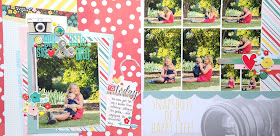
The layout I'm sharing was inspired by the photos my 6 year old took of me and his new baby brother.  I am nursing the baby in the photos, and since that's what I'm doing multiple times a day, it's not a surprise that my oldest son wanted to take pictures of me feeding his baby brother.  When I looked at the photos, I knew that I wanted to briefly tell about excited I am that we overcame some major hurdles in getting him to be able to nurse.  Nursing was not always easy for him, and after a 2 week NICU stay and 3 more weeks of his weight loss, I was overjoyed to be able to follow up with some happy scrapbook layouts!


I started out with 6 photos (2-4x6 and 4-3x4), so I knew I wanted to make a double page layout.  I really liked the XOXOXO patterned paper by Amy Tangerine, so I used that as the base all the way across both sides of the layout.  I added a few more strips of patterned paper and then started piling up the matted photos and scraps of patterned papers to build up the design.  


The thick yellow ribbon worked very well with the color scheme in the layout, so I added a bit on the upper left and some more on the lower right hand side of the layout.  I added my sticker title directly on top of the photo and a journaling card to house my story. 


Finally, I choose embellishments such as some yellow buttons, clips, hand painted wood veneers, and rubber pieces to dress up the photos.  I still felt that I needed a few finishing touches, so I used a notebook paper border punch to punch a few strips of paper and placed those under the embellishment clusters. I finished off the entire layout with Heidi Swapp and October Afternoon mist splatters. 


I'm so glad that my son took these pictures of the baby and I and I'm so glad that I was able to tell the follow up story of the baby's rough start.


Thank you for joining me today, stop back every day this week to see how the rest of the Design Team was inspired!