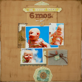
This ad grabbed my eye in a copy of Real Simple magazine. I loved the burlap, textured background, the mix of bright and subdued colors, and the symmetry.

I recreated these same elements for this layout, using the Sonoma County kit.


 Don't miss the Eight is Great challenge on our challenge blog! I made this layout for it!

Oh wow, these are divine, Just love the cute photos in the 2nd, gotta love the high heels, I love everything about them.
ReplyDeleteBoth of these are darling!!!
ReplyDeleteThese are great. I love your ad and how you interpreted it.
ReplyDeleteSuch a great idea! And the photos are precious!
ReplyDelete