Pages

Saturday, July 31, 2010

Movie Inspiration


It is time for some inspiration!!!
Often times I tend to be greatly inspired by the movies
that I see now. To name a few there's the recent
Alice In Wonderland, Series of Unfortunate Events,
Avatar, and the list would keep going. All these movies
have a deep since of art to their making which moves me
in a very creative way. Another particular movie that
is so delightful is this one here!
Just look at this poster!!! TONS of color and little bits
and pieces that make you want to play. I chose to pick
up the little bits of the Julys Sun-Kissed Kit and play
along. Here is what I came up with using some wonderful
scraps!


There was a certain part in the movie where they opened
up a room in his store and it was full of bouncing balls!
There were balls of all sorts thus the idea to make a few
of my own.
If this post today inspires you go grab one of many movies
that inspire you visually and get creating!
On a side note if you haven't seen this movie GO GET IT!!!
LOL! I garantee you will enjoy!
As always thanks for letting me share this part of the day
with you!

Friday, July 30, 2010

Kit Item


Good Morning Everyone!! Amy here. :D Today I am going to share with you a LO using my favorite kit item!!! I actually have three whole packs of these but hadn't used any of them yet. :P So when I got my Sunkissed kit (sorry, sold out!) and saw that it had a couple of the Maya Road Kraft envelopes that I had been hoarding and wanting to use for forever-I knew it was time to finally use one! :D Love love LOVE these! And I still have tons more to use so I have to start thinking of ideas to do so.

But the LO I made only used one, I wanted it to hold all my journaling. This LO is actually one of my favs that I have made in a while! :D I really like how it turned out, and the colors from the Sunkissed kit were just fantastic so it really made this a fun one to do!

The patchwork background on the top was super easy to do with my sewing machine! I just cut the squares and rectangles out and lined them up-putting just a tiny bit of glue on the back in the middle. Then when they were all dry, I stitched up the edges! :D (I can actually see though that I missed two spots though! :P Looks like I'll need to fix that! LOL!) But what was fun was I even stitched the kraft envelope on! :D (Have I mentioned how much I love those little things?! :D) Then the bottom border was pretty easy. It is just strips of paper cut with border punches and then the freehand cut paper at the very bottom. That bottom one was kind of different for me but it was fun! :D Trying something new. Then the title, and a few minimal embellishments make the rest of the LO. :D The only time consuming part is the patchwork background. But the work is well worth the effort.

And here is a little close up of some stitching and the gorgeous flowers!


Hope everyone is having a great day!!! Be sure to stop by the Noel Mignon message boards to check out the sneaks for the new kit coming out soon!! The sneaks are gorgeous so far!!! :D

~Amy

Thursday, July 29, 2010

My Latest Fave!


Hey everybody! Here's my latest fave!


Also, I've decided to give away two instruction class spots for the My Growing Up book class. All you have to do is post about it on your blog. Comment back on my blog that you've done it and be entered into the drawing! Post about it on Facebook for another entry! This is gonna be a great time - hope to see you there!


I have four more kits available for the class, so be sure to sign up soon to get yours in time! Signing up is easy - just click this link to go back to my blog and click on the 'My Growing Up Book" option on my storefront.

Wednesday, July 28, 2010

A Scraplift


  Happy Wednesday!  I have a scraplift to share with you today.  I decided to scraplift this one by Jules (theblingprincess).  Love everything about this.
My take is a little different - but it was definitely inspired by this layout.  I used bits and pieces from different Noel Mignon kits.

You can't really tell in this photo but I added a lace look to the black part of the cardstock.  


I also added some bling to the "lace"

That's all I have for now - have a wonderful day!
Michelle

Tuesday, July 27, 2010

Title Tip!

Good morning to you! I have a LO to share with you today of my 13 year old son and Noel's Lemonade Stand kit. (sold out) I did lots of spritzing and layering on this page and added some fun elements like twine, rhinestones, and hardware. The butterflies were cut using my Spellbinder's die. A brad and twine were added to their bodies.
For my title I did a couple of things.....I used two different letters and used a white gel pen to add a few dots to the top letters. It makes them pop just a bit more than if they were left alone. For the second part of the title, I cut out the banner using Quickutz Dies, and strung it under the word, "new." I love the look of banners! (Almost as much as I love those butterflies! )

And remember when these little letter beads were all the rage a few years back? Well I am here to revive them and bring 'em back! They work well to create a subtitle on your LO. I placed mine on a stick pin. (Thank goodness Kyle has a short name! LOL) I tied the stick pin with twine and adhered it to the LO.


Don't forget to pick up Noel's newest kit, "Office Party," there are only 5 left!!
Thanks so much for stopping by!

Monday, July 26, 2010

Color Scheme


Putting together color schemes is a fun way to create a layout! I used this combination of colors: white, dark pink, kraft, light pink and cream to create a sweet baby layout about my daughters and their great-grandma. The colors in the "Seaside Cottage" kit were perfect along with a few items from my stash. 


This layout was also created for the no patterned paper challenge over on the challenge blog


I cut a Hambly doily rub-on in half to frame the larger photo and a sticker from The Girls' Paperie was a perfect border along the bottom of my layout.


I used a Jenni Bowlin label sticker, Melissa Frances rhinestones, Making Memories chipboard alphabet, The Girls' Paperie sticker and some tulle to create my title. 


I also used a Jenni Bowlin bingo card above the smaller photos. I used my trusty Uniball Signo pen to create journaling lines.


Try using a color scheme when creating your next layout! 

Until next time,
Jill


Sunday, July 25, 2010

Office Party


This week I used an advertisement to create this page with the Office Party Kit. (If you haven't picked one up yet, there are just a few still available in the store HERE.) I almost hesitate to show you the ad I used, because my page didn't end up looking much like it at all. LOL! But I figure that is okay. :) I really used it as a jumping off point and then let the elements of my page direct me as I put them together.

Here is the ad I started from.


See that swoop along the bottom. That is where I began . . . can you see it on my page? No?! LOL! I know. It sort of got hidden as I built my other elements. :) I actually was going to cradle my photo and journaling underneath that swoop, but decided along the way that I liked the look of the artisan label chipboard shape holding my photo more . . . so that became my focus. :)


I went to add the circle element on the top left and it just didn't feel right for my photo . . . like it was out of scale or something. So I decided to invert the circle and have it coming from behind the photo instead. Then . . . I just created from there. :)


I used Virginia's Tool Play article about the paint brush to add some depth to this page. I painted the edges of a lot of my elements with Walnut Ink. I love the rustic look! Thanks, V!


My title was inspired by the Nitty Gritty Dirt Band song "I Love Only You". I added a Zva Creative pearl flourish from my stash to add a decorative element to the title.

Thanks for stopping by today!
Happy Scrappin!
Jana

Saturday, July 24, 2010

Photo and Journaling Tip

Happy Saturday everyone! Today I am going to share a couple of quick tips you can use on your layouts. Sometimes when I take a picture, there are a few distracting items in the background. In this case, I had a couple of little kids heads gracing the bottom of my photo. I usually edit things things out but I completely forgot and printed out the picture. Instead of throwing the picture away and reprinting, I decided to cover up the unsightly area with a few embellishments. I used some of the Jenni Bowlin tickets to hide the little heads and used this as a base to hold the title for my layout.

For my second tip of the day, how about creating a cute little journaling spot for your layout? Instead of just using the BasicGrey journaling spot all by itself, I spruced it up by punching out a scalloped circle, inked the edges, and placed it on top of Jillibean flower.

Here is my finished layout. All items are from the Office Party kit (only 6 left!)except for the Tim Holtz tissue tape.


Happy creating everyone! I am going to spend the rest of my weekend getting ready to head out to CHA on Monday. Maybe I'll see some of you there!

Until later!
Diana

Friday, July 23, 2010

Storage Tip(Card Storage)


Hi all!!! Another week has just flew by and what a week
it has been especially with CHA and all right!!! I so wish
that I could have gone to see all the gorgeousness in
person. Anyhow, on to todays storage tip!


When it comes to albums and placing my pages in them
I learned early on that it is not for me. I found myself
with all these albums either I won, was given as a gift,
or came in a kit. It is very hard for me to toss anything
and I am one of those persons again who think that
there is a use for EVERYTHING. LOL! So with that
being said I thought up a tiny idea of how to store my
cards in a photo album!


I like keeping all of my cards at about this size so this
album was perfect. My cards are constantly being
used so it is very hard for me to fill this up. It keeps
my cards safe, clean, and never have to wonder where
a specific card went. I pop this album open and they
are all there in one tidy place.


Thank you as always for letting me share!!!


Thursday, July 22, 2010

Seasonal Layout - Sunshine!!


So here's a layout that I did awhile back. I wanted it to be as summery and bright as possible. It was really important that I be able to match the colors in the photo while at the same time, bring out the colors of summer.


I used the stitched paper and 72 & Sunny papers by We R Memory Keepers in the Sun-Kissed Kit (sorry, sold out) and some awesomely adorable Cosmo Cricket Delovely Ready Set Chip.


These super sweet Thickers were just perfect for bringing out the "Sunshine" in the layout. Love em!!

Wednesday, July 21, 2010

Inspiration!


Hi everyone!! Today I am gonna talk to you about the things that inspire me! I actually have about 4000 or something websites and blogs bookmarked on my computer but only about a 1000 of them are organized. :P I will be the first to admit that that number is crazy, and that I most certainly have not looked at every single one of them in a couple years. But clearly there is a lot that inspires me!! :D
I do have the few set blogs that I go and visit on a regular basis, and the company sites I go to as well. But there are a few that I absolutely love and adore because they inspire in many different levels! :D One of these favorites is a site called Creature Comforts. Not only does it provide amazing posts that include colors and textures and gorgeous photos (that totally inspire me to be a better photographer!), but it also has fantastic DIY ideas and downloads for free!
One of my favorite things to get from this blog are the color schemes she puts together! She calls them Color Crush. :D Love it! This one is my fav of all time!! I gasped when I saw it! Using color schemes is one of my fav things to do in scrapbooking. It is so fun to put a LO together using only the certain colors in my scheme that I have chosen, and then seeing the finished result when it is done! My favorite part about it is that it challenges me to have to go through all my stuff to find things that work with the colors I need, which in turn uses my stash and keeps everything I own fresh in my mind! :D Losing track of what you own is real easy to do when you accumulate as much stuff as I have! LOL!
Well I had really wanted to share a LO with you that I had started using a color scheme, but with all the CHA stuff I'm trying to finish too, I just couldn't get it done! :( So I am cringing right now because I have a post here without a picture! :P But I am going to make the LO work for my next post and will be able to share it with you then! :D Until then be sure to check out the Creature Comforts blog for tons of inspiration!
And another place to go is the Noel Mignon Challenge blog! A new challenge just went up on Sunday and it is amazing!!! I love what the other girls did with it! It is a no Patterned Paper challenge, which means you can use cardstock, and stickers but just no patterened paper! I tried hard to make use of a whole bunch of my Hambly overlays and the massive amounts of rub ons I have!! Hope you get a chance to play along! Can't wait to see what you do!
Take care!
~Amy

Tuesday, July 20, 2010

Tool Play- Old Fashioned Style

I believe I mentioned on my last "Tool Play" post that I'm not much of a "tool" kind of girl. You could even say that I'm rather old fashioned in my limited style of tools that I use for scrapping.

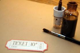
I'd like to share a technique I've been using lately with a very simple tool- the ol' paintbrush.

I was inspired by Michelle Clements' style of inking & painting with walnut ink, but as I am a rather impatient kind of girl, I decided if I could cheat my way into getting a similar look without having to wait for the drying time with walnut ink, etc. I bought a lovely color of Shimmerz from Noel, called Mud Pie, and instead of spraying, I unscrew the lid and dip my paintbrush in.

I'm using a little ticket from the Office Party kit. It's very cute, but it needs some aging. So- I brush on a thin layer of Mud Pie around the edges.
Once that dries (a few seconds later), I do another few swipes of the brush to layer shades.
I then dip my brush in a third time, and then splatter the paint by flicking the paintbrush. (Imagine it a la Harry Potter- swish and flick! It's all in the wrist.) ;)
I then use the most old-fashioned and ancient of all tools: my fingernail! I just rub it along the edges of the ticket and gently fold up the edges. They give way fairly easily since they have been dampened by the Shimmerz.
Pretty cool, eh?

I also used that technique on the newest "no patterned paper challenge". Using the chipboard shape included in the Office Party kit, I sprayed enough light blue (I think I used the color, "Twilight," from Glimmer Mists) to cover the whole piece, and then painted the edges with the Mud Pie color from Shimmerz. I did a layer of the blue, painted around the edges, too.

You can see how they all layer together. I also drew with a white gel pen to make the edges pop.
Here's a few more closeups of the layout: I hope you try out this old-fashioned tool! :)