Today is the last day of February!! I don't know about you guys but I am SO ready for spring! Unfortunately we're supposed to get more snow here in eastern Washington so who knows when spring will actually show up!!
Over the last few weeks I've shared some layouts and Valentines that I've created with the So Sweet Classic kit and today I wanted to share how I used the kit in my planner this past month.
The stickers and rub-ons this kit were perfect for planner pages, as was that cute stamp set and stencil with the distress ink.
What I also like to do with washi when I'm using it in my planner is to adhere it to some wax paper, then cut into small strips to use as pennant banners:
It's much easier to keep them relatively the same size and cut the edges that way.
So here are some more ways that I used the kit in my planner this month:
Pages
▼
Wednesday, February 28, 2018
Monday, February 26, 2018
{Sweetie} Layout with the "So Sweet" Daily Diary Kit
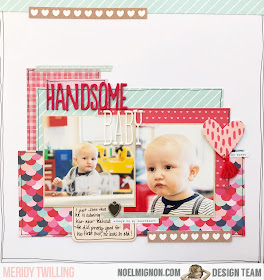
Hello Friends! It's Meridy with you today, and I'm sharing a Sweet layout using the "So Sweet" Daily Diary and Paper Add-On kits. These papers and embellishments lent themselves to the photos I had taken of my kids for Valentine's Day this year, the pinks and light aqua blue were the perfect match!
I started by layering a few scraps that I had left from the kit, and cut some strips of the doily print paper to add to the layers. Once I had my layers and photo in place, I decided I wanted to add ALL the flowers to the layout!
I started by fussy cutting a couple of flower bunches from the patterned paper to use as an anchor for the more delicate flowers.
Next, I went to work layering the paper flowers, sticker flowers, epoxy hearts, a heart charm, a few heart stickers, and some of the phrase stickers from the kit. Once I got the cluster how I wanted it, I did a very similar design on the opposite side of the photo.
I finished the layout off with a strip of washi tape to anchor the Thickers word "Sweetie" and added the date with a date stamp.
Have you been able to scrap some Valentine's photos this month with your kit? I would love to see on Instagram #NoelMignon. Have a great week!!!
Friday, February 23, 2018
Georgia O'Keefe Museum: February "So Sweet" Classic Kit
Hi all! Sarah here with my last layout using February's So Sweet classic kit. This week, we are being challenged to use a grid or circle design. I wanted to do the grid because I have these awesome pictures from a recent trip we took to Santa Fe, NM. We took our daughters to the Georgia O'Keefe museum because my older daughter loves art and we wanted to take her to a real art gallery. She loved it!
I used the Authentique plaid paper as my border and then the white cardstock as my background. For the grid, I took my cardstock to my sewing machine and stitched out the lines in a cream thread.
I used the small American Crafts letter stickers for my title since my blocks were on the smaller side. Around each small 2x2 photo, I did a double outline with my pen to help anchor them a bit. I love the look of the Pretty Little Studio word strips inside the metal frame.
For the journaling, I cut down one of the die cut tags to fit in the square. I love the little detail the florals add. The chipboard "love" from Simple Stories fit perfectly in the squares and I love it!
I added the year in the letter stickers on top of the chipboard doily and also some florals and the key at the bottom. The large gold heart helped to balance out the metal frame on the opposite corner.
I love how this layout turned out, it might be a new favorite! Thanks so much for joining me today!
Thursday, February 22, 2018
X's and O's and the February Daily Diary kit
Hello again!
Did you join us for last night for the reveal of our March kit?
I am so excited to receive and to start crafting with that cute kit but until then I have another project to share with you.
Today's project features the So Sweet Daily Diary kit and our new little kitty.
This kitty was part of a birthday gift for one of my kids and is now well-loved by the whole family. His name is Crookshanks, named after the cat in the Harry Potter movies.
I used some household items and 6x6 papers from the kit to trace and then cut out the circles on my page. I also sketched an X and cut that out, using it as a template for the x's on the page. I added some detail to those pieces with a Sharpie pen.
I layered the X's and O's with other patterned papers from the kit, then added Simple Stories washi tape strips, some enamel hearts and a few Pebbles rub-ons.
Have a wonderful day and thanks for stopping by Noel Mignon! ♥
Wednesday, February 21, 2018
Buds
I cannot believe there is only 1 week left of February. This month lasted like a minute! lol And while I'm super excited for spring - and for the You Go Girl kit reveal tonight!! - I'm still enjoying working with the So Sweet Classic Kit. And this week I created a page about my pups :)
We have 3 dogs and the littlest pup was adopted about a year and a half ago. Clearly all 3 have become buddies :)
I absolutely love that woodgrain patterned paper with the hanging hearts & couldn't wait to use it on a layout!
We have 3 dogs and the littlest pup was adopted about a year and a half ago. Clearly all 3 have become buddies :)
I absolutely love that woodgrain patterned paper with the hanging hearts & couldn't wait to use it on a layout!
Tuesday, February 20, 2018
A few cards with the So Sweet Daily Diary Kit
I know Valentine's day has come and gone, but I love making cards. The daily diary kits are perfect for this as they always contain fun little embellishments that fit a smaller size perfectly. This week the design team was challenged was to use a grid or circle design in our projects. I went for a grid design as the base of my cards and then built on from the main idea.
I started with cardstock from the main classic kit for each of my cards along with a few pattern papers. All the embellishments and stickers are from the daily diary kit.
This card I punched the pattern papers with a large square punch and then filled the spaces with elements from the kit. I popped up one of the small squares in the middle with foam adhesive.
One of my favorites in the kit this month were those cute little metal hearts charms.
This card was a more simplified grid since I only kept it in a square. I used the square stickers and then filled the opposing "boxes" with thicker hearts.
The sentiment is a phrase from a sticker sheet. I finished the top and bottom off with strips of washi tape.
You can see this card used that same grid idea and I filled some of the imaginary boxes with embellishments and then left others empty.
I used the square stickers from the kit, phrase stickers, and then a heart thicker with a couple of strips of pattern paper to finish off this simple card.
The last card I took a little more liberty with my grid. I started making a grid with the puffy heart stickers and then left a space in the center for my sentiment. It really resemble a grid, but it was the inspiration I started with. The sentiment is a rubon from the American Crafts sheet that I placed on a Project Life 3x4 card. I used foam adhesive to attach this to my card and then cut a few hearts from pattern paper to peak out form underneath.
I finished it off with some phrase stickers on the top and bottom.
I had so much fun with this weeks challenge. It really pushed me to play with the product in the kits in different ways. I love that!
What are you creating with this months kit. Are you stuck? Be sure to try this weeks challenge and share on the Noel Mignon Member Facebook page with all of us.
Monday, February 19, 2018
{5 Years} with the "So Sweet" Kits
Happy Monday! It's Meridy here today. I have a layout to share with you using the "So Sweet" Daily Diary and paper add kits. I went back to pictures from 2011 of my 5th Anniversary for this layout.
I started out by picking the patterned paper that I felt matched my photos to best, and started layering it on the page to form the base of the layout. Next, I used some of the 6x6 patterned papers from the Daily Diary kit to layer underneath the photo cluster. I cut apart a couple of the mini cards that read "You & Me Forever" and "My Heart Belongs to You" to use as embellishments on the layout.
Next, I added a journaling card and my journaling. Then it was time for a title. The beautiful gold Thickers make for an easy title and subtitle, so I went with it! The gold hearts on the Thickers sheet were another easy embellishment to sprinkle around the page. I also placed some of the typed phrase stickers around the page to add a little more detail.
I like the little bits and pieces I was able to use, such as washi tape and branding strips from the 6x6 paper pad, they just are just the perfect small accents to add to layouts.
Thank you for stopping by today!!!
Friday, February 16, 2018
Llama: February So Sweet Kit
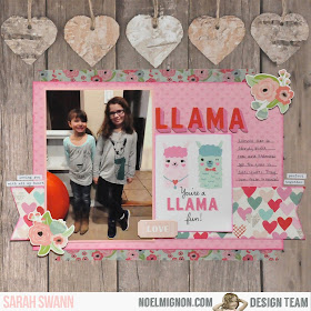
Hi! Sarah here with another layout using the February classic kit. Once I saw that llama die cut I knew exactly what to scrap! My girls both have llama shirts that they love to wear so I had them wear them on the same day and snapped a picture.
I thought it would be a fun way to document a trend since llamas seem to be everywhere right now.
I love the woodgrain paper and thought it would be a nice anchor for the pink and patterns I planned to use as well.
I used the Distress Ink that came in the kit to ink the edges of the papers to help tie them together and give them good definition.
The chipboard elements worked out great with the florals and the ticket and the little word strips helped add a little extra detail.
Thanks so much for joining me today! Don't forget to share your projects with us in the facebook group!
Thursday, February 15, 2018
in the mood to make cards
Happy February 15 ♥
I don't know what it is about Valentines Day but it had me in the mood to make some more cards this week, so that is what I have to share with you here today.
Both cards were created with the super cute So Sweet Daily Diary kit using the little Simple Stories sticker sheets. The only other things added was some twine, washi tape and a strip of patterned paper. Quick and easy!
I hope you're having fun with your kit this month!
Wednesday, February 14, 2018
love
Happy Valentine's Day!!! We spent the last few days with my youngest daughter working on her Valentine's for class. What fun :)
Anyway, I was going through some photos from a couple years ago and came across this cute one of my daughter and our pup Copper.
I started with that wonderful brick paper from Simple Stores that's in the So Sweet Classic Kit. Using that heart in the center as a jumping off point I started layering some patterned papers & chipboard stickers.
Here's a simple tip: if your page is looking a little "flat", try mounting it on contrasting cardstock like I did with this layout to make it pop!
Monday, February 12, 2018
Creating Coordinating Layouts with the "So Sweet" Daily Diary Kits
Hi Friends, it's Meridy here today. I have a couple of 12x12 layouts to share with you today using the "So Sweet" Daily Diary Kit and paper add on.
I really like the look of double page layouts in my albums, so that both sides match. I used to scrap double pagers almost 100% of the time. But I liked making single page layouts for the first and last page of my albums, and I wanted to make more. So I tried making 2 single page layouts with the same supplies (and pictures from the same event), this way when they are displayed in my album, both sides still match. I really like how it's working out. I still feel like the 2 pages flow together, but I get to be more creative working with a 12x12 space rather than always working with a 12x24 space.
The last 2 weeks I shared the following layouts:
Today I want to share the coordinating pages I made for them! This is the first layout. I used quite a few pictures, and layered up the paper and embellishments.
I tried to really use the same supplies that I used on the page I made a few weeks ago.
The gold Thickers, puffy hearts, and word stickers were just what I needed to pull it together. I was also able to mat the photos on the same red cardstock.
I think they will look great next to one another in my album. Even though they don't exactly match, they have some of the same elements, all of the same colors, and photos from the same event.
This is the page I made to coordinate with the layout I shared last week.
Again, I used the same elements, patterned paper, Thickers, the heart charm, washi tape, and the cute heart with the tassle.
I outlined each layer with black pen, just like I did on the page I created last week. This is just one more way that the layouts will flow together and "read" as coherent pages.
Here are both layouts that will go next to each other in the album.
Thank you for stopping by today!


