Hi Friends, it's Meridy here today. I have a couple of 12x12 layouts to share with you today using the "So Sweet" Daily Diary Kit and paper add on.
I really like the look of double page layouts in my albums, so that both sides match. I used to scrap double pagers almost 100% of the time. But I liked making single page layouts for the first and last page of my albums, and I wanted to make more. So I tried making 2 single page layouts with the same supplies (and pictures from the same event), this way when they are displayed in my album, both sides still match. I really like how it's working out. I still feel like the 2 pages flow together, but I get to be more creative working with a 12x12 space rather than always working with a 12x24 space.
The last 2 weeks I shared the following layouts:
Today I want to share the coordinating pages I made for them! This is the first layout. I used quite a few pictures, and layered up the paper and embellishments.
I tried to really use the same supplies that I used on the page I made a few weeks ago.
The gold Thickers, puffy hearts, and word stickers were just what I needed to pull it together. I was also able to mat the photos on the same red cardstock.
I think they will look great next to one another in my album. Even though they don't exactly match, they have some of the same elements, all of the same colors, and photos from the same event.
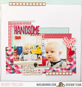
This is the page I made to coordinate with the layout I shared last week.
Again, I used the same elements, patterned paper, Thickers, the heart charm, washi tape, and the cute heart with the tassle.
I outlined each layer with black pen, just like I did on the page I created last week. This is just one more way that the layouts will flow together and "read" as coherent pages.
Here are both layouts that will go next to each other in the album.
Thank you for stopping by today!


So sweet!
ReplyDeleteThank you, Kirsty!!!
ReplyDelete