Hello! Thank you for visiting the Noel Mignon Blog today! I'm sharing my latest layout using the "Show & Tell" Classic Kit. This week you will be going "Back to School" with the Design Team as we share a few of our favorite techniques with you.
My first "technique" has to do with photography. I love when I am lucky enough to capture a split second of emotion in my photos---so I couldn't wait to scrapbook this photo of my son getting ready to walk out the door on his very first day of school ever. He was so excited and his backpack was so heavy he was trying to put it on without picking it up.
One way to capture emotion in a photograph, is to be patient and sit back (ready with your camera in hand) and wait. With kiddos, you can't "stage" their emotion, so you have to sit back and wait for it to happen---and eventually, it will.
I adore so many pattern papers in this kit that I was down to a few strips and scraps that matched the colors in this photo. I really wanted those patterns on this layout, therefore, I decided to put those scraps to work for me.
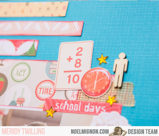
I used some of the scraps in strips to create the an interesting background for the layout. This was rally simple to do. They were already in thin strips, so I cut them to various lengths, inked the edges, and placed them on the layout.
I used one of the scraps and fussy cut 4 flash cards from the pattern to use as embellishments.
And finally I used a 1" circle punch to cut a clock from another scrap. Then I covered the circle with a 1" adhesive epoxy circle, creating my own little DIY flair embellishment.
I hope that I inspired you to try capturing even more emotion in your upcoming photographs, after all, the photographs and stories are the reason we scrapbook! I also hope you are inspired to use up some scraps on your next layout---it makes your Noel Mignon kit last even longer!


2 comments:
Merida, this is such a fun, colorful layout that draws you in to the picture of your son. Such a great job! Keep inspiring us all.
I love your layouts very nice bright too
Post a Comment