Friday, August 30, 2013

What I Want To Remember . . .

Happy Friday!!!  Today I'm excited to share a mini-in-progress with you all :)  I still want to add more pages but I'm happy with how it is unfolding so far.  When I began my assignment for this week, I spent a lot of time really looking through my photos.  I realized how many special moments I had from the summer that I really wanted to collect together & showcase.  I thought about a layout, but the layout mojo wasn't hitting me - so I opted to play around with a mini instead.  My thinking was that I wasn't going to stress to much about the overall design, but just create each mini-page & put them all together.  In the end, it created a fun, layered book, full of varying page types.  I used many supplies from the Our Summer kit, but also pulled from other past NM kits.  Doing something like this is actually a great way to use up bits & pieces from old kits :)

 photo mi9_zps70db5d7f.jpg


 photo mi8_zps484d3459.jpg

On the first page I chose to stitch a layer of vellum over the background patterned paper.  I love the softness it created :)  I also added a few embellishments around the photo, as well as a scattering of some sequins from my stash.

 photo mi4_zpsdea69431.jpg

The second page is actually a large tag that I layered everything onto.  Behind the photo is a patterned paper bag and a few small flags peeking out.  I also ran some washi tape along the bottom of the tag.

 photo mi7_zps61b05674.jpg

The third page was a fun cutting file I found HERE.  Although it was meant to be a folder, I glued it closed and then layered the photo on top of it.  I also added some brads in many of the circles - love how it gave a water-type feel to the page :)

 photo mi5_zps15a205e7.jpg

The fourth page is another cutting file you can find HERE.  The wood car was perfect for this pic of my sons riding the race car ride at the amusement park :)

 photo mi6_zps081e9606.jpg

On the fifth page I created a fun border by lining the edges with washi tape & then stitching over it.  The photo is layered over a journaling card and behind I tucked a tag, some adorable star stick pins, and an arrow sticker.

 photo mini3600_zps3280c49a.jpg

I think I had the most fun with this last page :)  I used the chevron cutting file HERE.  Then I lined the background with vellum and stitched over the chevrons.  I added in some gold rub-ons over the vellum here & there.  Then I layered up my photo and a few embellishments!!

 photo mini2600_zps5bc1235e.jpg

Mini albums are a great way to experiment with design & techniques :)  Hopefully this provided you with some inspiration to try your hand at a mini yourself!!  Have a great weekend :)

Thursday, August 29, 2013

My last Hello Sunshine Layout

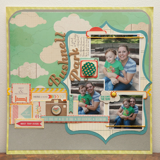
Hi everyone! Cassie here and I'm sharing my last Hello Sunshine layout (I still have a few cute cards I made with the kit I'll show next week too).  I have adored this kit, the bright colors have been great for inspiring me to scrap all of my summer photos- even if I am a year behind!


These photos are from my son's birthday last year (when he turned the big 2!), and he just had his third birthday yesterday! Yikes!  He's getting so big, and I am apparently a very slow scrapper lol.  My hubby and I always take off Charlie's birthday from work so we can plan a super special day for him.  Last year was the CT Science Museum and playing in Bushnell Park!


I used lots of Veronica's amazing Chic Tags for a cluster along the lefthand side and my Cricut to cut a fun bracket shape to house my photos.


I also love the idea of framing photo's with twine, so I put that technique to work here along the top and bottom of some of my photo's.


I hope you like my layout and enjoyed the Hello Sunshine kit as much as I did!  I am on the edge of my seat waiting for my Miss Nelson kit to arrive :)  Looks like it'll be beautiful!  Happy Thursday ladies!


Wednesday, August 28, 2013

a 2-pager!

Good morning! 
I've got a 2-page layout to share with you today. 
I find that I end up making a lot of 2-pagers because I take too many pictures & have a lot to say about them! 
The page I've got to share with you today is about a trip I got to make out to Utah back in April. 

{click on it to see larger}

I used the "Our Summer" kit to make this one.
I really didn't even use a lot of product on this page.
I used cardstock as the background, some patterned paper, chipboard letters for the title, and then a bit of twine. 
Sometimes there is just not room for too much product or else it starts to look too busy!
Here are a couple close up shots of the page...


Thanks for stopping by the blog today!
Have a good one!
:)

Tuesday, August 27, 2013

Don't LICK me, Ariana!


I try to get a picture (as most moms do) of their kids on their first day of school. Even my littlest, who is in MDO (where I also work!) wants her picture done. 

My dear friend is her teacher this year, so my kids have grown up always knowing her... so they are very comfortable with her. 

When I went to get the shot of Ariana with her, after we did the regular pose-y one, then my goofy little girl made things hilarious! I'm so glad I got the shot! 


(For some reason there is a funny glare on the photos on this layout, but it doesn't look like that in real life.) 

I had fun playing with the beautiful patterned papers in this kit. My main question that I started asking myself years ago with layout creations was, "What else can I add or take away?" In this instance, my addition was the strip of red & pink chevron paper behind the yellow chevron. I love the added "oomph" it gives to the bottom and how it grounds the page. 


I've had a lot of fun playing with the "Our Summer" kit this month! I can't wait for Miss Nelson to arrive! 

Monday, August 26, 2013

The Places You'll Go...

Hi
Today I'm sharing another layout with bits from "hello sunshine" kit. I'm pretty sure this kit has a LOT of life left in it. I am amazed at the amount of product that comes in each kit.
I just love this picture of my son on his handmade wooden go-kart. My husband and my then, 7 year old found old wood and made this kart in a day! SO MUCH FUN!!!
 Thanks for stopping by. Hope you enjoyed my share.

Friday, August 23, 2013

Making Memories

Hello everyone!!  Today I'm here to share another layout using the "Our Summer" kit.  There's so much bright & cheeriness in this kit!!  I decided to go 8 1/2" x 11" for this layout, as I plan on putting it in my personal album.  My personal album houses a lot of my favorite quotes used on layouts.  I'm a nut for quotes!! The pic is a quick snap Ryan & I took at the beach a couple months ago :)  I added in a white doily to my kit supplies to "anchor" the photo to the page.  

 photo making700_zps8208aea1.jpg

I had fun adding lots of little details here & there.  The "sweet moments" tag was cut from one of the journaling cards.  I also stamped on the cork arrow with the stamp set in the kit :)

 photo makingcu2_zps8bd12db8.jpg

For my title work, I used TONS of those adorable white Basic Grey alphas from the kit.  They do take some time to put down, but I love the look of them against the blue background!!  The "making memories" was cut using my Silhouette.  I added a few punched hearts and a bit of stitching :)

 photo makingcu1_zpsaaca7d73.jpg

Any good quotes on your minds these days??  Grab one & try using it for your layout title!!  If you need any quote inspo, feel free to check out my Words to Live By Pinterest Board!!

Thursday, August 22, 2013

An Artsy Take on Julie's Sketch

Hi everyone!  I loved Julie's sketch this month, how about you??  I really loved the clustered feel of the photos and the title so I shrunk the sketch down, kept embellishments super minimal (I am at the end of my Hello Sunshine kit after all!), and decided to accessorize using mists.  I used 4 different spray mists to splatter the background of my white cardstock, wrote some loopy journaling around the photos and then added vellum to the top and bottom instead of along the sides.  Totally a departure from my normal scrappy style, I usually use splatters as a small accent, not such a focal point on the page, but I really enjoyed stepping out of my comfort zone and creating something unique (for me) from this kit :)


I loved the wood title block in the kit that said "Life is Good On the Lake" but I haven't been to a lake in about 20 years so I thought I'd cover that little portion up with a Elle's Studio pennant flag housing the second half of the title.  'Life is Good in da' Hood' is a silly title that I think is double funny compared with my son scowling like a badass in all the pictures :P


Well that's my 7th layout from the Hello Sunshine kit, and I still have one more layout PLUS 3 cards to share! Boy do these kits last and last :)  Have a great Thursday!


Wednesday, August 21, 2013

Fun stamping technique!

Hey! Good morning!
I am not much of a stamper so it is a bit shocking that I am actually sharing a "stamping technique" today.
Well pick your jaw up from the floor because I am doing it!
Disclaimer: I am pretty sure this is not some earth-shattering, never-done-before technique but I am sharing it nonetheless.
:)
I am going to show you how to make the flower on this card using the teardrop-shaped ink pad in the "Our Summer" kit.


Hint: If you don't have this kit or an ink pad like this, you can also use one of the cateye ink pads.
Then all you need is that ink pad, a sheet of white paper/cardstock, pen, & scissors.


And this is what you do...
1). Stamp the ink pad all over the white paper. These will be your "petals". I use 5 petals for my flower but I stamped a few extra so I could choose the ones I liked best.


2). Outline the petals with black pen. Don't worry about outlining them perfectly. Sometimes the messiness is more fun!


3). Now cut them out. Once again, don't worry about cutting them out precisely.


4). Arrange them like a flower and add a fun center!


Done! Now you have a fun flower to add to a project!


Have a great day and thanks for stopping by the blog today!

Tuesday, August 20, 2013

Julie's sketch + my Daily album!


Have you checked out Julie's sketch for this month? It's a really fun one! I wanted to adapt it to my Daily Life album, and because I had several photos to use, I decided to try to give a two pager a try. I know, living life on the edge, hmm? Hehe


I started off with Julie's design, but then kind of just went with it and adapted it for my photos. (P.S. I love having a Selphy printer... I took those pictures yesterday morning! It's wonderful being able to print things quickly at home!)


Because of the size of my pages, I don't want to overload them with product, but you also know that I love to layer! I love that I can still focus on some smaller areas to layer by adding in pages like this that are more like traditional scrapbook pages, mixed in amongst all the pocket pages. 


That little wood veneer banner from the Our Summer kit was too cute. I just love it. 

Make sure to keep an eye on the official NoelMignon.com Facebook page- "Miss Nelson," the September kit, has been making some sneak peek appearances there! 


Friday, August 16, 2013

Summer Memories

Hello fellow scrappers!!  It's that time again . . . time for another monthly sketch challenge!!  This month our simple sketch features three photos and a few arrows to accent your page :)  Feel free to use the sketch as simply a starting point & get creative!!

 photo augsketch600_zpsee28b1cb.png

I used the "Our Summer" kit, along with this month's sketch, to create this page about an ordinary summer day with the kiddos at play :)

 photo summer600_zpse4b7a44a.png

You may notice the white misted circles in the background.  I used a Heidi Swapp mask from my stash and some white mist to create this fun background.  A quick, easy way to "dress up" some plain cardstock!!  You might also notice the stamped image on the cork arrow.  These fun arrows are in the Our Summer kit, but I decided to decorate them by stamping an image from the Dear Lizzy stamp set included in the kit as well.  They are super easy to stamp on & take the ink well :)

 photo summercu1_zpseb21aeba.png

For my title work, I grabbed some washi tape from my stash and layered the Basic Grey white alphas from the kit over top.  Using a brightly-colored washi tape was a great way to show off these alphas!!  I also added a few wood arrow accents and then a cut file from my Silhouette.

 photo summercu2_zpsc1580ae2.png

Alright - ready to join in this month's sketch challenge???  Your entry to this challenge is due August 30th.  Once you have completed your entry, be sure to post it in our Facebook group.  One lucky participant will be randomly selected to receive a $10 gift certificate to the Noel Mignon store!! Can't wait to see what you come up with :)

Thursday, August 15, 2013

Test Driving at Toys R Us

Hi Friends!  First off, your layouts and participation in the Summer Camp Crop totally blew my mind!! You guys are amazing, your layouts were gorgeous and I was so impressed with the talent PLUS the amount of layouts you guys were able to pump out in only 1 week!  I gotta admit, I could not have done 14 layouts in a week- wowzers!

Here's my layout for this week using the Hello Sunshine kit, number 8 so far, I believe :)  This pics were taken last summer at Toys R Us on a rainy day at an attempt to keep my 2 year old son busy hehe


That's it for this week- have a great Thursday :)