Saturday, January 30, 2016

Playing with layers x 2

Happy end of the week!

This week we've been sharing projects that feature the art of layering.

This is one thing that I do on each and every layout and card. It is a great way to give dimension and variety to your projects.

For this post I created two layouts- I wanted to do just one more before I break into my February kit.


For this page I started as I tend to do- I layered a piece of cardstock over patterned paper to make the foundation of my layout. I added spray mist and from there started adding paper, stickers and my pictures. 


I like to create layers of different heights on my projects. Here I clustered sets of little hearts and added them to my page with foam adhesive. I added some detailing to the cork alphabet stickers, too.  


For this layout I wanted to find a fun way to use some of the tags in the Sweet Charlotte Classic Kit. I used four on this page, creating a little tag with pictures, stickers and other embellishments before adding them to my layout. 


I added some embellishments flat on the page (rub-ons, stickers) and others I adhered with foam adhesive to give more dimension to the page. I layered my title stickers on a piece of wood veneer. 

How do you use layers on your projects? 

We'd love to see! 

Have a great weekend and come back to see us on Monday!


Friday, January 29, 2016

Chillin'

Hey guys! We're coming to the end of our week that has been all about layers. I love using layers on my pages to create depth and dimension! The easiest way of course is to do that with patterned paper. 

On my layout last week I created layers by using different sizes of patterned paper layered behind my photo. This week I went with more of a white space layout (that might be a sign that my brain is feeling cluttered this week!). 
So the way I created a bit of layering while still keeping the layout clean & simple is to add strips of paper to the top and bottom of my page. It adds some dimension and helps ground the page so that my photo doesn't feel like it's just floating in the center.
To further add some layering I layered a few embellishments, rub-ons & stitching. One further way to add layers without making your page seem bulky or busy is to add layers that are the same color but have different textures - like I did with the white doily on the white cardstock.

So don't be afraid to layer it up!!! 
 

Thursday, January 28, 2016

Daily Diary & Layers....Planner Style.

I cannot believe we are officially almost at the end of January!
How in the world has this happened already?

As I am still trying to wrap my head around this...I am also really excited to share how I used up the remainder of my January Daily Diary kit this month!


This week's challenge was all about "layers".  So I thought...well...why not add some of these gorgeous elements as layers into my planner?  So fun, right?!?

I kept things super simple here....as I still need to add in my journaling for the remainder of this month.  However I wanted to share just how awesome these Daily Diary kits are for incorporating into planner systems.  They are so versatile and have so many cute items to include in my planner.  Yay!

 I love layering scraps, cards, and punch outs from the kit on to my planner pages.  


This month's kit also came with the cutest frames, stickers and die cuts.  Not only are they awesome alone...but again...perfect for layering!  I loved layering the frames around the cards, placing stickers atop the die cuts...using 3x4 cards as matting...so many ways to layer this month!


Wednesday, January 27, 2016

Heart of Gold Classic Kit: XOXO

Happy Wednesday, Friends! Jana Eubank here with my first page using the swoon-worth February Heart of Gold Classic Kit. This kit contains all of my very favorite colors for scrapbooking Valentine's day, so you know I just couldn't wait to dig into it!

XOXO

This week the design team has been inspired by "Bundling Up" for the cold this time of year by using lots of layers on our projects. My favorite ways to layer on a project include combining several patterned papers together and also using lots of handcut elements.

I began my page by clustering my three photos together, layering them slightly over one another and then anchoring them on a band of layered paper strips and a large patterned paper circle.


As I built my page from there, I tried to keep the "layering" concept at the forefront of my thought process. I handcut several flowers from the My Mind's Eye Hello Gorgeous floral paper and tucked them around my photos. For the journaling, I layered two labels on top of one another and then added the title on top of those ... layering it over my main photo.


Machine stitching in pink thread around the circle and edge of the page, help to define things a bit.


I handcut several doilies from the Echo Park Paper Blowing Kisses paper and tucked them in with the flowers around the photos, layering them together for more impact.


The bottom right corner of the photo grouping is finished off with a label phrase sticker from the We R Memory Keepers Crust sticker sheet. I layered two of the gold Prima flowers over the right edge.


I love how the flowers and doilies add a sweetness to this Valentine page of my daughter! And I had so much fun layering all the different patterns and handcut elements together.

How do you like to layer on your projects?


Tuesday, January 26, 2016

Loving Layers

Hi Bloggers! Happy Tuesday. Lynn here to start off this weeks theme: "Layers". I LOVE this theme - layering papers or embellishments gives a page so much depth and interest! Layering is a breeze with Noel's kits and this month's "Sweet Charlotte" Classic Kit is no exception. There is so much product in these kits and everything is coordinated so perfectly! For my layout I started with a large circle which I created with the tube from the Heidi Swapp Color Shine. I took off the cap and scribbled a circle with the spray tube - I was purposely messy! The circle became the base for all my layers. This is one of my FAV photos of my sweet Simba.
I layered several pieces of patterned papers and my photo was the final layer.
I fussy cut a bow and layered it on the "O" in LOVE. I layered some of the pom pom ribbon over a scalloped cut piece of paper. How seriously cute is the pom pom ribbon?!?! I think I have some in every color!
I also clustered some flowers and a flair button together.
Let's see how you add layers to your pages! Please share your projects with us on the Noel Mignon Members Group on Facebook! Thanks for stopping by today and we'll see you tomorrow with more layering inspiration!
 

Monday, January 25, 2016

Documenting Wk 4 with Sweet Charlotte

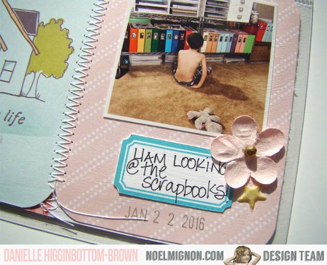
 Hi! Danielle here today to share with you my Week 4 of Project Life using the Noel Mignon Daily Diary Kit - Sweet Charlotte.
I am in love with the colours of this months kit! Soft and pretty with pops of bold colours, like the yellow pom pom trim, and the enamel dots.
Here is the right side of the spread. I added another shaker pocket this month with the gorgeous confetti from Pretty Little Studios.
Here is the left side of the spread. The acetate card reads backwards, because it was on last weeks spread, but that doesn't bother me. I like the "see through" element.
 Here is a close up of it. I love all the stitching that I have been incorporating this year. 
 I added some Stickles to my cards
 I love the alphas that were included this month. They add a fun pop of color!
 I also created my own 4x6 cards by stitching together 2 of the 2x4 cards that came in the kit.  Another element I like are the flowers that were included this month. They are perfect because they lay flat, so they don't bulk up the pages!

Thanks for stopping by! I hope I have inspired you to create something today!


Saturday, January 23, 2016

Fun with stamps and mist

Hello! I hope you've enjoyed all of the fun projects this week showcasing the stamps and spray mist in this month's kit. Our team has done a beautiful job. 

To tell you the truth, it took me a little while to jump on the misting bandwagon after it started a few years back. I liked clean pages and didn't want to make a mistake on my layout that I couldn't correct. Finally I ventured out into the world of misting and now use it on just about every page that I make. 

Before sharing my layout for this week I wanted to show you three ways that I tend to use spray mist on my projects. 

First of all, I use it as intended- simply spraying it out of the bottle on my page: 


Second, and probably the method that I use most-  removing the nozzle from the bottle and shaking it over my page to create a splatter effect. I tend to use more than one color but wanted to showcase the beautiful Heidi Swapp Patina Color Shine mist from the Sweet Charlotte classic kit. 


Thirdly, I like to use the mist to "paint" the edges of a project, to create journaling lines or other shapes. You can use a paintbrush or even the straw of the spray nozzle to add some color to your project. 


Here is my project for this week. As you can see, I've "painted" the edges of my page, did some splattering with the mist and also drew some lines upon which I added my journaling. 


I incorporated the stamps by adding a hyphenated line border under my title and also with the little heart stamp from the kit. I jazzed up my title by mixing the two alphas from the kit with a phrase sticker. I tucked a rub-on under my bottom photo and then layered two tags before adding the other elements. 


I continued the heart theme on my page with these cute heart stickers adhered with dimensional foam.  


I finished off the page with some sweet phrase stickers, a cork bow and flower elements. The "XO" is another rub-on from the Sweet Charlotte Classic Kit. 


How have you used the stamps and mist from this month's kit? 

Please feel free to share your tips and ideas on our Noel Mignon kit club member's page. 

Join us again next week for more great inspiration!


Friday, January 22, 2016

fourteen

This week is all about using that awesome mist & stamp set that came with the Sweet Charlotte classic kit! I don't know about anyone else but that stamp set has quickly become one of my favorites and I've used it in some way on every project I've created with this kit so far! 

My layout this week has lots of layers of patterned paper. This is usually how I get around the busyness of some the patterned papers. I find that if I pair them up with more neutral papers they add a nice accent to my page without being overwhelming. 
After I placed my patterned papers in the background I used the mist by unscrewing the cap and flicking the paint on my page. I like the look of droplets so very rarely will I actually spray on the page (unless I'm making a background for a card).

Hard to believe my oldest daughter just turned 14...I started scrapbooking when she was just 3 weeks old! I did a little stamping with the #today stamp by stamping it a couple times without re-inking to make some of the stamped images look a little more faded.
I also added some ribbon at the bottom of my photos by putting a strip of adhesive & then wrinkling the ribbon as I adhered it. Then I ran it through my sewing machine both for the look and to help keep it adhered. That wooden banner was perfect for my 'fourteen' spelled out in the Elle's Studio alphas in the kit!

Be sure to share how you're using the mist & stamp set over in the Noel Mignon facebook group!!
 

Thursday, January 21, 2016

The Perfect Added Touch-Stamping & Your Pocket Pages

Hi everyone!
Today I am here to share you a very simple layout I completed in my pocket page album...and how I used the awesome roller stamp from Dear Lizzy that was included in this month's kit.  

Stamps are so much fun to use...when we remember to use them right?!?
I know I am guilty. I have a ton and really need to use them more because they are so simple, yet add such awesome touches to pages and projects.


For me, this layout is all about the subtle details.  The stamping being one of them.
The stamping actually looks so awesome that it doesn't even look like an "add on".  The way I added the sentiments to my page actually looks like the cards came like that already.
So awesome, right?


There are so many different ways to use stamps in projects, but I decided this time around I would add my stamp sentiments as an additional "embellishment".  I simply added my stamped image onto my tag embellishments and onto a pocket page card that already had text on it.


As you can see, I added the "follow your heart" and "pretty please" image directly onto the heart die cut.  The "happy dance" image was stamped onto the super cute banner die cut.  I then added a simple puffy sticker. Love the combo.


On the left hand side of my layout I added the "XOXO" stamp sentiment directly onto a pre designed 3x4 card from the kit.  You may actually recognize that I altered that card as well.  I really wanted to use it for this layout, but the colors that were on the card did not exactly match my scheme.  So I simply found some coordinating paper from the kit and trimmed off some to adhere over top the portions of the card I wanted covered.  Easy right?  I love when you can alter products to make them fit what you are working on. SO great!

So once that was done I used the roller stamp to simply add my extra sentiment!


Stamps are such an awesome way to customize ones layouts and scrapbook projects.  After using this awesome roller stamp this month I am more inspired than ever to continue adding stamps onto my projects. I hope you are also inspired to use your stamps more too! They really are so much fun.

Wednesday, January 20, 2016

Sweet Charlotte Classic Kit: Happiness

Happy Wednesday, friends! It's Jana Eubank, back with another layout using the completely lovely Sweet Charlotte Classic Kit (pick one up for yourself HERE).

This week the design team's theme is "Stamping Through the Snow" and we are focusing on ways to use the stamps and mist that was included in January's kit.

I selected a few photos of my daughter playing in the snow for my page today and as I was holding the photos up to the papers in the kit this ombre woodgrain was calling my name! I love the way the pink wash fades into the woodgrain. It has such an etereal feel and complimented the pink in my daughter's snow suit perfectly!


The first thing I decided to do was to create some large washi tape snowflakes on the background of my page to surround my photos. For the medium and small snowflakes, I simply cut the washi tape in half length-wise. I left the edges sticking up slightly so that they would have more of a dimensional look to them. I then sprinkled the Heidi Swapp mist and a few sequins around them for an icy feeling! I love it!


I didn't want to detract from the awesome ombre happening in the background, so I decided to keep my embellishments simple and tone-on-tone. I used the brown cork letters for the title on the top half of the page where the background was woodgrain ... and then on the bottom of the page I used the pink Heidi Swapp "favorite" word where the background was pink! Brown-on-brown, and pink-on-pink! Kind of a fun thing to try out!


The lighter pink on the kraft tag and the neutral wood veneer and kraft colored die cut pick up the mid-tones in the middle of the page.


Finally, I decided that my page still needed "something."  I pulled out the stamps and decided to use the dashed line as "stitched" accents throughout the page. I'm sure it is meant to add journaling lines to the typewriter stamp, but I thought it looked like stitching. I stamped a few clusters at the bottom of the page, to the left of the journal spot, and then again to the right of the title. It was the perfect finishing touch, and I really love how this page came together!


How are you incorporating the stamps and mist into your projects this month? We would love to see! Come share them with us on the Noel Mignon Facebook page, or leave us a link in the comments of this post.

Happy Winter!


P.S. Don't forget! Tonight is the February Kit Reveal Night on Noel's Kit Reveal Party Facebook Page!!! I can't wait to see all the goodies we will get to play with next month. Hope to see you there!