Saturday, April 29, 2017

Explore... Under the Stars...Adventure


I have one last layout for you from the awesome Let's Get Lost Daily Diary kit... I had all these leftover scraps of cute "adventuring" embellishments, so I whipped up a quick two page spread for my pocket album. The photo & layers in the middle actually pop into the binder itself, so they are like a mini page or flap stuck in there in between the bigger pages. 


I've been busy working on some pages using the new Delightful kit this weekend... and my reveal video as well! I can't wait to share them with you! 


Friday, April 28, 2017

The Grand Canyon: April's "Let's Get Lost" Classic Kit

Hey guys!  Sarah here with my last layout using the Let's Get Lost classic kit.  I really wanted to redo a layout that I made a long time ago.  During a cross-country military move, we were driving from California to Florida and decided to make a few pit stops.  One of them was The Grand Canyon.


I really wanted to use that Pink Paislee mountain scene paper since it really resembled the Grand Canyon to me.  Since I didn't want to cover it up too much, I used 3x3 photos and minimal embellishments.


I used a few papers leftover from other layouts and layered them up, using some Tim Holtz Distress Ink to bring them together (not included in kit).  I also used some Heidi Swapp Colorshine in Ocean all around both sides of the layout.


For the embellishing, I used a few stickers from We R Memory Keepers which had the blue tones I was looking for.  I also love the Pink Paislee puffy heart sticker that has the same mountain pattern as the opposite paper.  I adds a perfect echo of pattern to help bring the two sides together.


I used some of the teal cardstock to matte my photos.  For the "Under the Stars" theme for this week...I used a few gold glitter stars from the Thickers pack.  I cut out a heart from the Shimelle patterned paper which had the perfect colors in them.


To finish off, I added a few stickers and echoed the pink woodgrain banner from the other side of the layout.  And the WRMK sticker that says "Life is a GRAND Adventure" was just too good...right?

Thanks so much for joining me today!  Have you ever looked back on a layout and wanted to redo it?  Don't be afraid to go for it!


Thursday, April 27, 2017

Share your sparkle

We've seen a lot of nature layouts using the Let's Get Lost kits this week.

I took on the other challenge given to the team- to incorporate stars into my layout.

I decided to create a star on the background of my page using strips of the star patterned paper in my Daily Diary kit.


After cutting 1/4" strips of the star paper I pieced together the outline of a star and adhered that to my cardstock base and then added some spray mist for some extra color on the page. 


I added a strip of the cute black and white washi tape from the kit to the bottom edge of my layout. From there I added my photos directly over the bottom corner of the star and then added some chipboard and epoxy shapes into the background. 


I love the big accordion flowers in the kit but since this isn't a travel-themed page I decided to layer the "be your best" chipboard over the top of the flower. 


Thanks so much for stopping by to visit today! 


Wednesday, April 26, 2017

Game Day

Hey all! Are you all having fun playing with the Let's Get Lost kits?? They're pretty amazing! Today I'm sharing a simple & clean layout from my daughter's first tball game along with a coordinating pocket page. Oh my gosh, these little ones playing ball are the cutest!!
I was inspired by this layout that I found on Pinterest & used the mountain papers in the kit to create a similar design. Not only do I like those little mountains but it's fitting since I live in the PNW :)

After that I took a Project Life pocket page (design A) and cut it in half vertically so I was left with 2-4x6 slots and 2-3x4 slots. I used that for the few extra photos I had from that day. I could have created a 2 page spread but I like doing this because it adds visual interest to my scrapbooks when you're flipping through the album and there's different sized pages. 
I used cards from the daily diary kit along with more alphas from the classic kit. You can see I also added one of those tab stickers along the side of my pocket page.
Note: the chipboard alphas from the classic kit are not very sticky (like most thickers). Make sure that you secure them somehow, either with stitching like I have on these pages or with a thin line glue stick (I like the one from Stampin' Up!). Otherwise you'll find a mix of alphas at the bottom of your page protector!


Tuesday, April 25, 2017

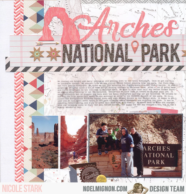
Arches National Park with the Let's Get Lost Kits

Hello everyone!  Nicole here today to share with you something that hardly every happens - a double page layout.  I used both the daily diary and classic kit to put together this two page spread and I'm really loving the results. 


I started with the pattern paper.  I had two pieces of the map pattern paper and chose this for the majority of the background.  I then cut strips and placed them on both sides of my spread creating framing in my pictures. 

I then started my title.  I paired the thickers with a silhouette cut to spell out my title.  I also cut the iconic delicate arch from the same pattern paper and placed them all together.  I finished embellishing with the cork/puffy stickers. 


My journaling I ended up printing out on vellum so I wouldn't have to cover up the pattern paper. 


The second page I kept simple and added a small cluster with the date and three of the Queen and Co. lollies.  My last touch to tie the two pages together was by running a piece of washi tape along the top of the spread. 

I really love the way this turned out and really need to try and do double spreads more often - love how many photos I used!  Thanks so much for stopping by the blog today.  Happy Scrapping :)


Monday, April 24, 2017

{Camp Cookout} with the "Let's Get Lost" Classic Kit

 Hello friends!!!  It's Meridy here, I have a double page layout using the "Let's Get Lost" Classic Kit today.  I choose some camping pictures from 2011 for my "Camp Cookout" layout.


I choose pictures that coordinated well with the mountain paper in this month's kit, then pulled a few more sheets of coordinating patterned paper from the kit to compliment those pictures. 


I was able to fit 6 photos on this layout, and still have lots of room to play with embellishments, add some journaling, and add a title.


I cut apart a "camp" die cut that came in my kit and made it into a little banner to create my "Camp Cookout" title.  I dressed it up with the deer flair, a cork sticker, a tag, and a puffy sticker from the kit.  I added a few sequins from my stash to give the title area a little more interest.


I treated my journaling area the same as my title, repeating the same elements so that the layout and embellishmnets flow from one page to the next.  I used the cute stamp that came in this month's kit for my journaling block.


Finally, I made a third embellishment cluster with the same elements that were in the title and journaling areas.  This formed a visual triangle across the entire layout.  I felt like the layout needed a little more "grounding" so I punched some starburst circles from a Martha Stewart punch I have and placed them to look like scallops across the bottom of the layout.  


That wraps up my layout for today!  Thank you for stopping by!  I would love to see your work on Instagram #NoelMignon.


Have a great day!


Saturday, April 22, 2017

Our Life Never Looked So Good- Pocket Pages!


The lovely combination of color and detail in the Let's Get Lost Daily Diary kit makes for such interesting contrast in my Pocket Page album. I'm finding my groove with this style and I really love that I have an album documenting our daily life. 


 I've been using the "Collect" app to organize my daily pictures and keep captions under each one so I can remember special things about each day. This has been so handy when I've gone to print the pictures because I can trim those captions to use in my album.


Friday, April 21, 2017

Hitting the Slopes: April "Let's Get Lost" Classic Kit

Hey guys!  Sarah here with a very old picture of myself with my family when we were living overseas.  My father was in the military and we lived in Europe for a few years.  While there, we took advantage of where we were and did some traveling.  One thing we did almost every year was go on a group trip to Austria to do some skiing.  


All of the mountain papers really spoke to me to create this layout for my album about my childhood.  And it was perfect, since we are literally on a mountain in the picture!


The title fit perfectly right above the photo and I used a mix of the Thickers and the We R Memory Keepers tiny alphabets.  To top off the title, I used a puffy camera sticker from Pink Paislee and a Shimelle wood button with more mountains.


I wanted something bold on the bottom so those gold glitter Thickers were great for that.  I also added a few more little details including the black and gold washi tape.  To add some more dimension, I fussy cut around the mountain paper to give them some height and an added detail under the photo.


For the journaling, I used a die cut and covered up the sentiment with a strip of the washi so it made more sense for my layout.  

I hope you enjoyed this layout and it helps inspire you to pull out some older photos and get them documented.  Thanks for stopping by today!


Thursday, April 20, 2017

Wishes for my girls

Hello again! 

It's hard to believe that another week has gone by. The time is just flying! 

A friend of mine lost her mother just over a week ago and I don't mean to be mushy but times like this, like when my father in law passed away last year, cause me to be a little sentimental. 

We really don't know how much time we have with those we love so it's important to show them our love and make the best of each and every day. 

I have four daughters and while some days they make my hair turn white (seriously- not gray but white) I do love them and am so proud of them for the wonderful girls they are. 

So, here is my project for the week using this month's Daily Diary kit, Let's Get Lost. 


The 2x3" cards are perfect for pocket pages or extra journaling. For this page, though, I used the reverse sides in a grid pattern to add a mix of coordinating designs to my layout. I used a larger 4"x6" card to anchor my title before adding my photo. I used some strips of the washi tape from the kit to add the black and white contrast to the page. 


I trimmed down a 2"x3" card to make a smaller journaling spot. I added lots of chipboard, leather and enamel accents to the layout, including attaching a piece of ribbon to the back of the cute leather circle. 


Here you can see the different layers on my page and some of the embellishments I used. For the top right of the page I cut down the "go see do" card to a smaller size and added a tiny flair and some enamel dots. Noel always adds a beautiful mix of textures to each of her kits and I love the variety that adds to my projects, whether I'm using the Classic kit or the Daily Diary one. 


Thanks for stopping by here today. 

We hope that you have a great rest of your week and don't forget to stop by for the reveal of next month's kit! Visit us at our Facebook page for more details!