Happy Thursday! Today I have a new two-page layout to share to continue my weekly blog series in July. Today's layout uses the "Mary Ellen" kit to highlight some detail photos of the party decor I made for the girls' 2nd birthday. I printed most of the photos in wallet size so that I could fit quite a few across the two pages. One of the ways I try to make a two-page layout work for me is to enlarge the design elements. On this layout, I carried out the banners with the large pennant pieces on the left side and then on the bottom of one of the photos on the right page.
I ran out of "T's" so I cut out the "T" from the chipboard frame to use instead.
I love the little Maya Road star pins and stuck one out of a Girls' Paperie rosette.
If two-page layouts intimidate you (like they often do for me), try simplifying your design and it might come together easier. Also, try an 8.5 x 11 two-page layout if filling 12 x 24 inches seems like too much!
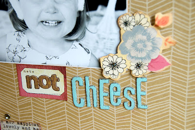
I also have a "bonus" layout for you today using the "Bee's Knees" kit. My little Lily thinks we ask her to say "cheese" when we ask her to say "please." This photo is actually in the moment. It's just one of those little things I want to remember...her sweet, "cheesy" smile. I love the printed kraft cardstock from American Crafts. It adds just a subtle texture to a layout.
I also LOVE the foldies from Sassafrass Lass in the kit.
The Elle's Studio tags are perfect for housing part of my title.
And here, I layered a Glitz sticker, GCD Studios and Cosmo Cricket patterned paper, Maya Road paper posies, My Mind's Eye twine and a Cosmo Cricket rhinestone.
Finally, I have a sneak peek for you of a new layout with the August kit, "Salt Water Taffy." The kit goes up for sale tomorrow morning! I'll reveal my layout in full tomorrow on my blog.
See you next week!
Jill


1 comment:
I just found this site through the Papertrey Ink website where there was a photo credit link to here... This site is FABULOUS!! Your layouts are magnificent!! I love the style here!
Post a Comment