
Hi Everyone!!! I wanted to share today a layout I made for the NSD challenge our Jill posted for us this last weekend! The challenge was to create a layout using an old kit and then submit it! :D I still have yet to do the submitting part but I am half way done with having the layout done!
I decided to use the kit from last November-Dear Diary. I LOVED this kit! :D And it killed me that I didn't get to do more with it (Noel just packs so much in them things!!). Ontop of doing this for the NSD challenge, I also combined it with the Layout Tag happening on the member board! I had a blast lifting the person in front of me, and can't wait to see the whole thing put together! But because of that, I can't actually show you my full layout. :( So you are stuck with some extremely sneaky sneaks!!
One thing that I did a lot of on this layout is layering. Tons and TONS of layering. I do this on a lot of my layouts because it creates lots of depth and texture. Those are two things that can get lost very easily on a project. Here are a couple things that I do on my layouts to make sure they have some depth and texture.
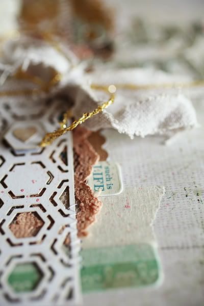 The above image is a great example. It has frayed linen that I used as ribbon on my page! So easy and simple. Not only is it a ribbon tied in a bow (which comes off the page and adds depth), it is also worn and frayed (which adds texture)! I got this out of my linen closet, just a table cloth that is now ripped into shreds. :D Another thing in this image is masking tape. I wasn't super duper huge on masking tape until I got the Very Virginia kit that had a whole roll of this in it! Now I use it on almost every layout!! :D So I have Noel and Virginia to thank for this!
  The next photo has another example of things I do: paper layering to the extreme! This is so much fun! I do this not only to have more depth and texture on my layouts, but to get little color accents and pops on my page without using a huge amount of any certain paper. I like the little accent of yellow in this image. :D Makes me happy!
 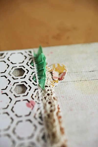 The ribbon accent above was super fun to do but man I will admit it was kinda hard! Laugh! Getting silk seam binding to do what you want it to is not easy. It took a lot of folding and pre-sewing to get it to stay so that I could use my sewing machine on it. But the end result was sooo worth the effort! And one other thing that I didn't expect is the depth it created with the Basic Grey doily!! I only pinned this doily down in a couple spots so that it would come off the page a little, creating more depth, but what it did here with the ribbon was an added bonus. :D
 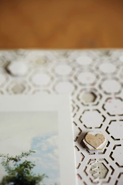 The technique above is a new one to me. I got the idea from Christine Middlecamp, who does it all the time on her layouts. When there is a repeating pattern on a piece of paper you are using, play into that by cutting a couple of the pattern pieces out and poping them up on top of corresponding pieces. :D It is so easy, yet so ingenious. It is one of those things where you say to yourself 'Why didn't I think of that?!!' Laugh! Anyway, this was my first time doing it and I loved it! Of course I changed it up a teeny bit and added hearts to a couple of them. And in case you hadn't noticed the Basic Grey doily that I used here I actually turned over and used the backside of. I love the backside of all the doilies and have used them like that several times.
 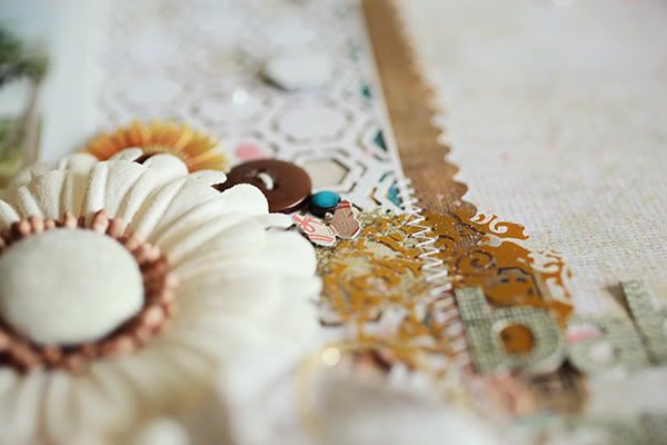 This image shows several things that are fun to do. One very prominent thing is using a piece of patterned transparency. Noel always puts some of this in most of her kits and I love that! I used a punched piece of the Hambly transparency here and stitched right through it. I love colored transparencies because you can layer so much underneath them, and still be able to see all the you put under there! So much depth there it is awesome! :D Another thing there is a huge mix of embellishments. I have a button, a brad, a punched butterfly, two flowers and you can see the shimmer of a pearl up at the top there. Using 3-D embellishments is always a plus in making your layouts have more movement and depth.
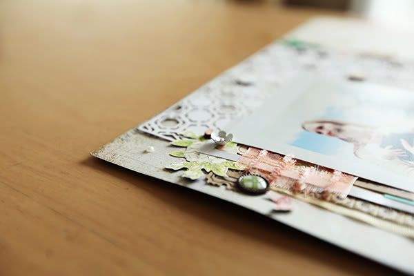 This last picture doesn't really show much, I put it up just kinda for fun. :D Just to tease you that much more! Laugh!! Please let me know anytime if there are any questions I can answer about any of my layouts. :D I would be more than happy! And I will update this post as soon as the full reveal happens!
 Hope you are all well!! Take care!
~Amy
~Amy

1 comment:
great tips Amy!! :) now i want to see the whole layout though!!
Post a Comment