
Hello! It's Meridy today. I have another 2 page layout to share using the beautiful "Vintage Charm" Classic Kit. The design team has been challenged to use some of the frames that came with our kits this week, so I have included 3 of them on my layout today. I like adding frames to my layouts because they add so much dimension.
I started with a set of baseball pictures from my daughter's first year playing. I really like to challenge myself to scrapbook sports photos (especially for my daughter) without them looking like typical sports layouts with team logos and themed embellishments. Sometimes those types of embellishments look very masculine to me. Instead, I used the colors in the photos to guide me in choosing them to use with this month's kit.

I focused the left side of the layout on her team and individual professional photos.
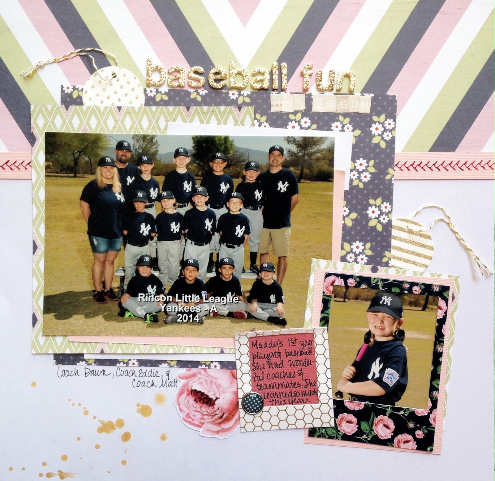
I started with the cute chevron paper called "Neighborhood" by We R Memory Keepers, from the Honey I'm Home line. I layered a few scraps of cardstock with another We R Memory Keepers patterned paper and one of the Simple Stories papers from the kit to matt the team photo.
My favorite detail of the layout has to be the machine stitching I did with red thread on pink cardstock that mimics the stitching on a baseball.

Next I added my frames! I used a Pretty Little Studio frame to house her individual photo. I also used some of the packaging from the Jen Hatfield Gold Scalloped Washi to create a gold and white honeycomb frame. (I did this on the layout I shared last week as well!) I used this "frame" to hold my journaling. I layered those frames with a die cut and a Simple Stories adhesive brad to finish them off.

I had fun mixing and matching the alphabet fonts from this month's kit to create the title "Baseball Fun Has Begun".

On the right hand side of the layout, I used a collage to fit quite a few photos that I wanted to include. I added another frame on this side of the layout as well. I actually turned the frame around, so the white back is facing up, because I preferred a white frame to the pattern that was on the front of the frame. The white matched the layout better in my opinion.

I added a few bits of journaling and some more of the mini letter stickers along with the "LOVE" wood veneer (that I painted white) to wrap this side of the layout up.
I finished off the double page spread by sprinkling some of the Heidi Swapp Gold Color Shine mist across the pages.

Thanks for joining me today! Have a great week!

1 comment:
Oh such pretty colors!
Post a Comment