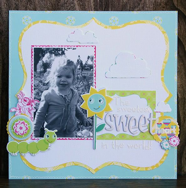
Hi Everyone!! Today I am going to share with you a quick Title Tip! Titles are always hard for me. I don't think I have had a single LO where the title was the easiest thing on it. :P And it almost always comes after the LO is done. (I am a little title challenged! LOL!)
The LO I am going to share today I actually made a little bit ago, and includes the gorgeous Delovely collection that was in the last two kits, Sunkissed and the new Limited Edition Pocket Full of Sunshine!
Now I am going to confess something, the Delovely collection is just a wee bit brighter than I am comfortable with using. Everyone has their comfort zone, and mine just doesn't happen to include brighter colors. LOL! :D So instead of diving head first into the collection and using them all in massive amounts, I decided to balance with a lot of white cardstock! :D That toned it down a lot for me.
You are probably wondering now how this relates to my title. Well like I said before, with majority of my LOs the title comes last. And in order to keep the balance of the colors and the white, I decided to use all white letters for my title! :D And on this particular LO, that actually meant doing a tone-on-tone technique. Meaning I used the same color letters as the background they sit on. But at the same time I didn't want the letters to just blend away into the background so I did a few things to try and make the title stand out a bit more. First thing I did was I used two different letter types-one of them a glitter to add more texture, and the other a chipboard to add more depth! The chipboard especially adds a lot of pop with the tone-on-tone and really draws your eyes to it! And the last thing I did to help the title stand out a little more was to make a paper embellishment to go under part of my title that happened to play into the words of the title. :D I used punches and decorative scissors to create a scallop circle that had a whole bunch of punched hearts in the middle, and put the last half of my word 'sweetheart' on top of the paper embellishment! :D
Well I hope this inspired you some today!!

Have a great Sunday everyone!!

4 comments:
Wow you sure fooled me, you look like you are right at home with the brights here, I just love love the idea of toning down with the white, the clouds with the little edge of colour is divine and the diecut with the edge rocks too, yes inspiring, thanks. Melxx
Oh I just adore this LO and that title......FABULOUS!!!!
Thanks for sharing this wonderful tip with us!!!
I LOVE this layout. Great use of the white for a "background", yet on top of your base patterns. The white on white title is is a great touch. :)
Love the tone-on-tone title, Amy!
Post a Comment